| Author | Thread |
|
|
08/24/2006 07:33:12 PM |
maybe a cookbook kind of picture, has a kitchen quality to it.
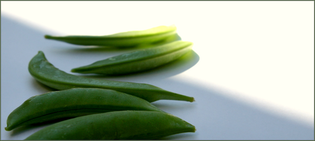
darker shadowed foreground severely cut in half on a diagonal to hot lighted background makes a strong graphic statement. The bright/dark effect seems a bit strong and to an extent overpowers the peas. Emphasis of the peas themselves appears somewhat weak - due to the dof/sharpen issue others have mentioned.
Presentation is good w/delicate finely crafted beautiful frame.
Congratulations on your new purchase..... Sigma 10/20mm I think a wonderful choice for your excellent architectural eye, but also work with it for closeup it will surprise you.
Message edited by author 2006-08-26 11:23:54. |
|
 Photographer found comment helpful. Photographer found comment helpful. |
Comments Made During the Challenge  |
|
|
08/19/2006 09:25:49 AM |
| Nice colour and sharpness. It seems overexposed on the top right. |
|
| Photographer found comment helpful. |
|
|
08/18/2006 12:45:57 PM |
| Nice composition. Maybe the two peas should be more in focus. |
|
| Photographer found comment helpful. |
|
|
08/18/2006 12:13:09 AM |
|
| Photographer found comment helpful. |
|
|
08/16/2006 03:10:45 PM |
| Lighting is a little harsh, nice idea. |
|
| Photographer found comment helpful. |
|
|
08/16/2006 12:15:59 PM |
| If the spotlight is on the two peas you should have reversed the focus. Focusing on the rear peas and have the front peas out of focus. |
|
| Photographer found comment helpful. |
|
|
08/15/2006 02:39:33 PM |
| I think you have a creative idea for this challenge; however, there are a couple of things I think you could do to improve your score. First, the two peas in the spot light are not in as sharp of focus as the peas in the foreground. Your title tells the viewers to look there but the focus issue forces the viewer to look back to the peas in the foreground. Second, your concept would have been stronger if the light on the peas was more like a spot light. Again, your title raises a certain expectation that the image doesn't meet. |
|
| Photographer found comment helpful. |
|
|
08/15/2006 10:39:09 AM |
| I like the two pods disected by the light and shadow, but I would nearly have left out the 3 foreground pods altogether, they seem dull in comparison to the highlights on the background pods. Still like the shot tho, nice one |
|
| Photographer found comment helpful. |
Home -
Challenges -
Community -
League -
Photos -
Cameras -
Lenses -
Learn -
Help -
Terms of Use -
Privacy -
Top ^
DPChallenge, and website content and design, Copyright © 2001-2025 Challenging Technologies, LLC.
All digital photo copyrights belong to the photographers and may not be used without permission.
Current Server Time: 03/12/2025 12:23:58 PM EDT.