| Author | Thread |
Comments Made During the Challenge  |
|
|
09/07/2006 07:07:15 AM |
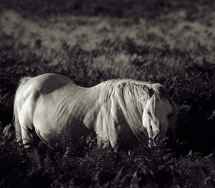
| This is different and emotional horse imagery. 8 |
|
 Photographer found comment helpful. Photographer found comment helpful. |
|
|
09/07/2006 05:58:02 AM |
| Nice b/w conversion. I like your title. |
|
| Photographer found comment helpful. |
|
|
09/06/2006 12:13:50 PM |
| cute little guy, but the natural lighting wasn't working, not enough contrastness for me, and I see on his haunches that if it was bumped up it would blow that out. Difficult image. |
|
| Photographer found comment helpful. |
|
|
09/06/2006 11:33:15 AM |
| the horse does seem lost, and not just lost, but coming apart... losing itself to the flora it is immersed in. I think this effect is created by having the cutoff right at the torso and having its nose immersed. You are right on the edge: is it a picture of a horse, or a field? I love the edge. Also, a beautiful raking light on the horse. 9 |
|
| Photographer found comment helpful. |
|
|
09/05/2006 01:44:36 PM |
|
| Photographer found comment helpful. |
|
|
09/05/2006 10:45:09 AM |
| what tall grass and weeds...interesting capture here! 10 |
|
| Photographer found comment helpful. |
|
|
09/05/2006 12:59:56 AM |
|
| Photographer found comment helpful. |
|
|
09/04/2006 12:12:17 PM |
| pretty interesting shot here. I might hvae liked a slightly higher contrast but it works very well this way as well. |
|
| Photographer found comment helpful. |
|
|
09/03/2006 10:33:08 AM |
| Pretty horse. Good use of tones and shadows. |
|
| Photographer found comment helpful. |
|
|
09/03/2006 07:42:40 AM |
| stunning...love the light...love your choice to go b and w...great title |
|
| Photographer found comment helpful. |
|
|
09/02/2006 06:56:42 PM |
| very nice image to present in b/w with that wonderful light enhancing this contented looking horse |
|
| Photographer found comment helpful. |
|
|
09/02/2006 01:38:10 PM |
| That's a nice angled light playing on the horse - good timing. I like your choice of duotone? It enhances the image. |
|
| Photographer found comment helpful. |
|
|
09/02/2006 11:30:58 AM |
| beautiful. great lighting and setting. 8 |
|
| Photographer found comment helpful. |
|
|
09/01/2006 11:54:48 PM |
Great choice for a black & white and good use of shadows to bring out depth.
The subtle details in the shadows work well here. |
|
| Photographer found comment helpful. |
|
|
09/01/2006 08:02:06 PM |
| It loos famished and the tone adds a cool (as opposed to warm) deathly tone to it. That horse doesn't look healthy. Is that why he's 'Lost'? |
|
| Photographer found comment helpful. |
|
|
09/01/2006 03:55:54 PM |
| I love how3 you have used the available light..this is a top quality shot...shadows/light mix is beautiful...great work! |
|
| Photographer found comment helpful. |
|
|
09/01/2006 02:35:31 PM |
|
| Photographer found comment helpful. |
|
|
09/01/2006 12:31:29 PM |
|
| Photographer found comment helpful. |
|
|
09/01/2006 06:15:28 AM |
| I think I would prefer less space above the horse and more contrast so that we can see the left side of the head more easily. Lovely though. |
|
| Photographer found comment helpful. |
Home -
Challenges -
Community -
League -
Photos -
Cameras -
Lenses -
Learn -
Help -
Terms of Use -
Privacy -
Top ^
DPChallenge, and website content and design, Copyright © 2001-2025 Challenging Technologies, LLC.
All digital photo copyrights belong to the photographers and may not be used without permission.
Current Server Time: 03/12/2025 02:21:15 PM EDT.