| Author | Thread |
Comments Made During the Challenge  |
|
|
08/03/2002 11:39:00 PM |
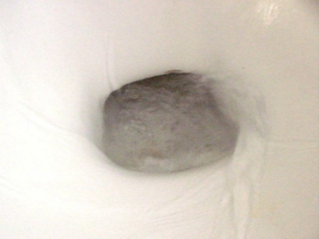
| This is just a toilet - now if you pretended (since you don't want to have to call a plumber) to be flushing something, say a stock portfolio or what-have-you, it may make better sense to the viewer. |
|
|
|
08/02/2002 09:51:00 AM |
| I do understand your interpretation here... I wish you could have found a more visually appealing way to show the mood. This particular image lacks contrast... - jmsetzler |
|
|
|
07/31/2002 07:16:00 PM |
| Interesting concept. I would have liked more focus and maybe a glimpse of something corp related going down the drain. That could be pretty hard on the plumbing though. It's also a little hard to figure out what this is without the title. |
|
|
|
07/31/2002 06:26:00 PM |
| Sorry, but this is a terrible shot of a cliched image. |
|
|
|
07/30/2002 11:57:00 PM |
Composition - poor. What is "down the drain" ?
Technical Aspects - ok
Meets Challenge - not really
Visual Impact / Originality - poor
|
|
|
|
07/30/2002 10:16:00 PM |
| Yet another toilet photo. |
|
|
|
07/30/2002 01:30:00 PM |
| Too fuzzy. A better setup would've helped |
|
|
|
07/30/2002 01:18:00 PM |
| It's not crisp enough and it's actually rather bland. Interesting that it's one ot 2 toilet pictures this week. What if you scanned in some money and printed it out on the color printer and flushed that? it would give the viewer something to focus on and liven up the photo. |
|
|
|
07/30/2002 10:20:00 AM |
| We've seen quite a few examples of this idea this week and this is, sadly, not the best. Focus is badly off and there's a general lack of colour and depth. A stronger light off to one side would have put highlights on the water that would have more clearly defined things. Also stepping further away from the subject would have shown us that this is, in fact, a toilet. |
|
|
|
07/29/2002 11:25:00 PM |
| seems to be a very soft focus/ or out of focus. maybe if the water had one of those little blue tablets, or there was a little sailboat going round and round. |
|
|
|
07/29/2002 09:10:00 PM |
| I get the idea, but the shot just doesn`t work for me... |
|
|
|
07/29/2002 08:39:00 PM |
| This would have been really great if it were more in focus. It looks like the moving water fooled the auto focus and couldn't fix on any one part. |
|
|
|
07/29/2002 06:53:00 PM |
| Two toilet shots this week. It's a stretch, but I'm going along with the idea. Personally, I think the shot needs more to connect it to the corporate concept, maybe cr@p wrapped in $$ or a very red balance sheet, that sort of thing. The toilet alone just isn't enough and the title isn't supposed to "save" you. Since I already gave the other toilet a 4, but it was tweeked wierdly and your's isn't, I will give you one more point, so 5 it is. Swash |
|
|
|
07/29/2002 03:34:00 PM |
|
|
|
07/29/2002 09:35:00 AM |
| Nice idea, though you need a lot more light so the water doesn't blur. Without the title, I'd be wondering what I was looking at. |
|
|
|
07/29/2002 09:24:00 AM |
| Thanks for wasting my time. |
|
|
|
07/29/2002 08:42:00 AM |
| Interesting. Focus is a bit soft, lighing is good. |
|
|
|
07/29/2002 03:20:00 AM |
| Down the drain? The economy or aesthetics? =) |
|
|
|
07/29/2002 02:02:00 AM |
| Sorry but this is not very visually interesting. It does fit the theme, though. |
|
Home -
Challenges -
Community -
League -
Photos -
Cameras -
Lenses -
Learn -
Help -
Terms of Use -
Privacy -
Top ^
DPChallenge, and website content and design, Copyright © 2001-2025 Challenging Technologies, LLC.
All digital photo copyrights belong to the photographers and may not be used without permission.
Current Server Time: 04/02/2025 07:46:10 AM EDT.