| Author | Thread |
|
|
08/21/2006 10:26:40 AM |
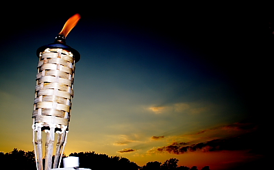
My biggest issue is not the size of the image as much as the over-active vignette-ing (thats the big black halo in your picture - it almost looks photoshoped in). I do like the concept. the colors are a tad dark and the torch is a bit blown out. I would suggest a longer shutter speed and a lower iso next time. As to your torch being blown out - what you might want to do next time is this: a simple technique called - diffusion - dont quote me on the actual term name so much as the technique.
Here's what you do - its very technical and challenging so pay close attention here.
Put a plastic bag or some wax paper over your flash.
This spreads out the flash so you still get decent lighting without "burning" (thats the area which is pure white).
Granted there are other solutions but if you want a quick, cheap - diy(do-it-yourself) fix. This will help. |
|
Comments Made During the Challenge  |
|
|
08/20/2006 05:40:01 PM |
| I like the sunset in the background and the fact that the torch has a nice bit of clarity is good. I wish the lighting wasn't quite so harsh on the torch though. The small size of the image detracts a bit as well. If a reshoot is possible, I'd suggest a slightly different perspective so that you don't have those white things at the bottom of the torch, without having to crop out some of the deeper colors of the sky. I gave a 5 |
|
 Photographer found comment helpful. Photographer found comment helpful. |
|
|
08/19/2006 10:56:02 AM |
| I like the flame on the torch but feel a slightly different angle and less dark on the right handside would have had more impact (MHO) |
|
| Photographer found comment helpful. |
|
|
08/18/2006 10:09:57 PM |
| Nice color in the sky, but the tiki seems overexposed for the shot. |
|
| Photographer found comment helpful. |
|
|
08/18/2006 06:41:09 PM |
| That's a really good picture, but I wish it was bigger. |
|
| Photographer found comment helpful. |
|
|
08/17/2006 08:19:51 PM |
| Straighten the torch up and crop out the thing at the bottom |
|
| Photographer found comment helpful. |
|
|
08/17/2006 01:46:15 PM |
| I'd rather see the full sky, than having it burned out like it is |
|
| Photographer found comment helpful. |
|
|
08/17/2006 01:08:27 PM |
Aw, wow - beautiful colors. And I love the way that the black surrounds part of the image. I am such a fan of rainbow colors and I love what this sky shows. I also like how the torch is brightly lit without being too bright or taking away from the background.
Of course it would have been so much better at a larger size (max 640 pixels allowed) so I could see all of the beauty and appreciate it more! |
|
| Photographer found comment helpful. |
|
|
08/15/2006 10:52:59 AM |
| Too small. Images may be 640px wide. You might want to consider this next time. |
|
| Photographer found comment helpful. |
|
|
08/15/2006 09:22:44 AM |
| Nice shot, one of my three 10's |
|
| Photographer found comment helpful. |
|
|
08/15/2006 07:36:35 AM |
| Too bad this is so small. If you need help figuring out how to make it larger PM me after the challenge is over. I will explain. good luck. |
|
| Photographer found comment helpful. |
|
|
08/14/2006 10:45:28 PM |
| This would not be bad, but it's just too small! |
|
| Photographer found comment helpful. |
|
|
08/14/2006 08:43:04 PM |
| Kind of small. Increasing length and width would've helped this heaps. |
|
| Photographer found comment helpful. |
|
|
08/14/2006 08:26:06 PM |
| IMO this picture would have been nice if it were bigger. The background is great. The white cap at the bottom of the torch is a little distracting though. |
|
| Photographer found comment helpful. |
|
|
08/14/2006 06:36:05 PM |
Neat shot but I am sure you have already heard that your image is to small. I am not going to let that detract from my score but it will from others. 5
Erick |
|
| Photographer found comment helpful. |
|
|
08/14/2006 02:54:06 PM |
| the light on the tiki torch is too bright, imho. detracts from the effect. |
|
| Photographer found comment helpful. |
|
|
08/14/2006 12:15:07 PM |
| I don't like the black areas around the edges. |
|
| Photographer found comment helpful. |
|
|
08/14/2006 10:26:35 AM |
| great concept, the torch is a bit blown out in my opinion ... sunset is amazing ... |
|
| Photographer found comment helpful. |
|
|
08/14/2006 08:18:16 AM |
| this would be better if it was bigger so we could see it better...you can save up to 640px and you have 400 here, so it's hard to judge...sorry :-( |
|
| Photographer found comment helpful. |
|
|
08/14/2006 03:56:30 AM |
| the torch has some blown areas and is bit harsh IMHO |
|
| Photographer found comment helpful. |
Home -
Challenges -
Community -
League -
Photos -
Cameras -
Lenses -
Learn -
Help -
Terms of Use -
Privacy -
Top ^
DPChallenge, and website content and design, Copyright © 2001-2025 Challenging Technologies, LLC.
All digital photo copyrights belong to the photographers and may not be used without permission.
Current Server Time: 12/14/2025 07:30:48 PM EST.