| Author | Thread |
Comments Made During the Challenge  |
|
|
08/19/2006 09:23:13 PM |
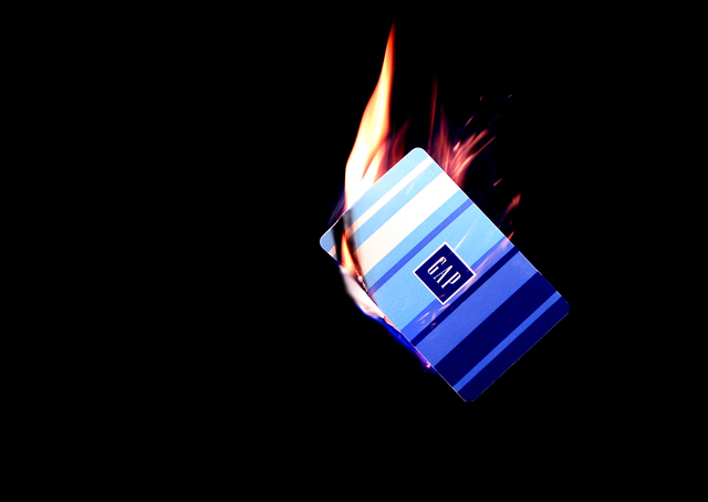
| don't burn the Gap card! oh no!!! :-) |
|
|
|
08/17/2006 10:42:39 PM |
|
|
|
08/17/2006 08:16:00 PM |
| This should have been cropped a lot tighter and the vast blackness draws my eye away from the card |
|
|
|
08/16/2006 05:06:52 AM |
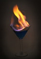
| Nice image. There's a good feeling of motion and there are a lot of ways to see what's being portrayed. I see it more as a freedom from the card like its being burned AND tossed away, though I'm guessing that wasn't the intent. Rather basic in composition, which is nice. Lots of clean negative space to bring the attention to the card and flames. Lighting seems a bit harsh, focus is good though a bit soft to my eyes. Overall I gave a 6 |
|
|
|
08/15/2006 10:47:10 AM |
| What's the meaning ? I don't get it... |
|
|
|
08/15/2006 09:04:33 AM |
| LoL. during back to school season I think everyones credit cards are burning up from over use. very creative take on the challenge. |
|
|
|
08/14/2006 10:22:45 PM |
| This photo is hurt by a mostly uninteresting composition and a lack of crisp focus. |
|
|
|
08/14/2006 04:56:15 PM |
Nice idea! Love the negitive space and it has a little wow factor in it. Nice Work! 8
Wazz |
|
|
|
08/14/2006 08:05:31 AM |
I'll send you my credit cards and you can have a go at them as well!
I would have gone for a square crop perhaps |
|
|
|
08/14/2006 02:56:05 AM |
|
Home -
Challenges -
Community -
League -
Photos -
Cameras -
Lenses -
Learn -
Help -
Terms of Use -
Privacy -
Top ^
DPChallenge, and website content and design, Copyright © 2001-2025 Challenging Technologies, LLC.
All digital photo copyrights belong to the photographers and may not be used without permission.
Current Server Time: 03/14/2025 06:08:54 AM EDT.