| Author | Thread |
Comments Made During the Challenge  |
|
|
09/07/2006 11:25:16 PM |
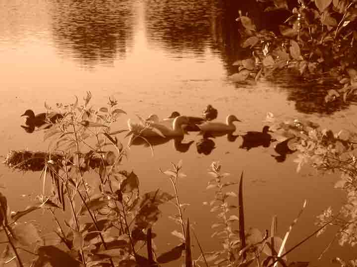
| old mysterious looking image. with the critters blured and noisey water. its fair. |
|
|
|
09/07/2006 02:10:13 PM |
| ducks hidden, foreground too busy |
|
|
|
09/06/2006 09:38:44 PM |
| After the chalenge, feel free to contact me by PM on preparing an image for a challenge. This image has been compressed so much that there is a lot of "jaggies' and compression artifacts. The file size we were allowed was 200kb, and see yours here was 22kb. Not real keen on the overall tone either. |
|
 Photographer found comment helpful. Photographer found comment helpful. |
|
|
09/05/2006 11:17:34 PM |
| I like the idea but the sepia tone does not work here and the birds are a bit out of focus. The composition is good but it would probably would work better if it was in color or if you had more contrast in the sepia tone. |
|
| Photographer found comment helpful. |
|
|
09/05/2006 02:12:48 PM |
|
|
|
09/03/2006 10:31:42 PM |
| The Sepia is okay, but it doesn't help the weaker composition. |
|
| Photographer found comment helpful. |
|
|
09/03/2006 08:58:26 PM |
| This photo breaks all the rules: poor focus, dead center subject, oversaturated color. Yet it somehow works, giving a dreamy feel that nicely portrays Saturday at the Lake. But a little too much jpeg compression I think; the artifacts distract from the overall feel. |
|
| Photographer found comment helpful. |
|
|
09/03/2006 07:38:06 PM |
| seems very pixelized. not sure if you had to upsize or not but it doesnt seem to have worked well. sorry. |
|
| Photographer found comment helpful. |
|
|
09/03/2006 07:13:34 PM |
| a little too grainy and out of focus for me... |
|
|
|
09/03/2006 04:47:40 PM |
| There are major jpeg or compression artifacts, the picture is not sharp and the attempt at sepia looks dreadful. |
|
|
|
09/03/2006 08:18:44 AM |
| the focus is in the wrong place...it's on the branch in the foreground...should be on the ducks...sorry |
|
| Photographer found comment helpful. |
|
|
09/03/2006 05:50:26 AM |
| The focus is a bit distracting to me and I don't know if the color works for this image. |
|
| Photographer found comment helpful. |
|
|
09/02/2006 05:17:25 PM |
| Whoa. There are some serious compression issues here. Your shot is only about 20K when you could submit up to 200k for this challenge. The use of sepia seems gratuitous here, too, I'm afraid. I don't see how it adds to the shot; it makes it look like a muddy, dirty river. |
|
| Photographer found comment helpful. |
|
|
09/02/2006 02:37:04 PM |
| Blurry and looks like it is out of focus. |
|
|
|
09/02/2006 08:43:13 AM |
| Your treatment gives this an old photo feel. I think I like it. |
|
| Photographer found comment helpful. |
|
|
09/02/2006 03:16:43 AM |
| Seems to be a bit odd-looking around top centre. Maybe something has happened in the resize, it doesn't look quite right. The rest of the photo has a nice dreamy effect to it. |
|
| Photographer found comment helpful. |
|
|
09/01/2006 11:19:26 PM |
| OOF photo has a jaggered look to it and water has some unwanted elements that I feel would have been better if they were retouched. |
|
|
|
09/01/2006 02:22:01 PM |
|
|
|
09/01/2006 01:00:57 PM |
| Lots of jpeg artifacts here. |
|
|
|
09/01/2006 11:58:50 AM |
| The ducks are out of focus and they foliage is a distracting element>dont think the sepia lends itself to this shot either. |
|
| Photographer found comment helpful. |
|
|
09/01/2006 09:40:12 AM |
Composition: 3 - Seems very cluttered with the main focus centered, which doesnt work here imo
Technical: 3 - The jpeg compression is way too strong. You had 200kb to work with in this challenge, but you only used 22. This results in artifacting and also it looking very soft.
Creativity: 3 - A different angle to make this more unique would improve it
Appeal: 2 - With the artifacts, softness, crowdedness, and also the way too strong orange colour, the photo doesnt appeal to me at all, sorry.
Overall Calculated Average Score: 3 |
|
|
|
09/01/2006 07:46:25 AM |
| The color tone si just not working for me here. I find the branches pretty distracting as well. |
|
| Photographer found comment helpful. |
|
|
09/01/2006 04:28:38 AM |
| Foucs seems a little off, I'd prefer to see the ducks crisper and the foreground less enhanced |
|
| Photographer found comment helpful. |
|
|
09/01/2006 01:22:14 AM |
| the quality on this looks rather low |
|
| Photographer found comment helpful. |
Home -
Challenges -
Community -
League -
Photos -
Cameras -
Lenses -
Learn -
Help -
Terms of Use -
Privacy -
Top ^
DPChallenge, and website content and design, Copyright © 2001-2025 Challenging Technologies, LLC.
All digital photo copyrights belong to the photographers and may not be used without permission.
Current Server Time: 03/12/2025 02:39:31 AM EDT.