| Author | Thread |
Comments Made During the Challenge  |
|
|
08/22/2006 11:32:00 PM |
| blurry, otherwise good shot |
|
 Photographer found comment helpful. Photographer found comment helpful. |
|
|
08/22/2006 02:35:02 PM |
|
| Photographer found comment helpful. |
|
|
08/21/2006 12:41:20 PM |
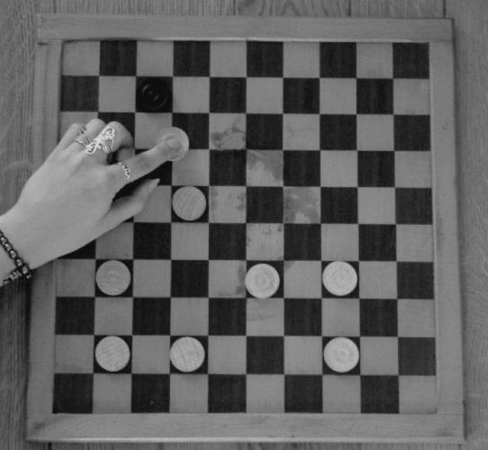
| It seems a little soft to me. A shade more contrast and a touch more sharpening. I�m not sure where the sharpness went � is it a focus issue or lost in post-prossesing? |
|
| Photographer found comment helpful. |
|
|
08/20/2006 08:34:29 PM |
| I see! It took a while but know I what is so stupid in here. Cool idea, but unfortunately the shot is a bit blury. The fingers are pretty and fit well. |
|
| Photographer found comment helpful. |
|
|
08/20/2006 04:04:34 PM |
| Pretty funny! I'd like it better in color, without the water(?) stains on the board, but it is still a great idea. |
|
| Photographer found comment helpful. |
|
|
08/18/2006 05:29:12 PM |
| The colouration is a little strange and the board would be better lined up with the edges of the frame |
|
| Photographer found comment helpful. |
|
|
08/18/2006 08:00:53 AM |
Sorry but I don't see the Stupid, Stupid part of this image. The closest I can come to for Stupidity is that the black still thinks they have a chance to win even though there is only one black piece remaining. This image also suffers from poor contrast. The whites need to be whiter and the blacks blacker. I suggest you read the B&W conversion tutorial written by photomann under the Learn/Tutorial menu.
Edit: Now I see the Stupid, Stupid part, as the black piece will actually win. Guess I was too stupid to catch it.
Message edited by author 2006-08-25 12:18:37. |
|
| Photographer found comment helpful. |
|
|
08/17/2006 04:17:46 PM |
| Real hard to tell the color of the tokens... |
|
| Photographer found comment helpful. |
|
|
08/16/2006 02:38:40 PM |
| very clever. made me go through the rest of the game :) |
|
| Photographer found comment helpful. |
|
|
08/16/2006 02:32:41 PM |
That's pretty stupid!
As a picture it's really dark, I think it'd be improved with some more light or even color. It seems a little bland. |
|
| Photographer found comment helpful. |
|
|
08/16/2006 12:11:30 PM |
|
| Photographer found comment helpful. |
|
|
08/16/2006 11:22:54 AM |
What I like: Great idea, well executed
What I don't like: Constrast seems a bit low, hard to see the black piece, might be a bit overcompressed (looking at the detail around the hand) |
|
| Photographer found comment helpful. |
|
|
08/16/2006 01:50:59 AM |
| Overall the tones in this shot are really flat. I think a bump up in brightness / contrast would help this out a ton. I do like that you've made the viewer stop and think about what it is I'm looking at and you've setup the board perfectly. Few tweaks and I think you'll have something. |
|
| Photographer found comment helpful. |
Home -
Challenges -
Community -
League -
Photos -
Cameras -
Lenses -
Learn -
Help -
Terms of Use -
Privacy -
Top ^
DPChallenge, and website content and design, Copyright © 2001-2025 Challenging Technologies, LLC.
All digital photo copyrights belong to the photographers and may not be used without permission.
Current Server Time: 03/12/2025 07:59:28 PM EDT.