| Author | Thread |
|
|
09/11/2006 04:34:17 PM |
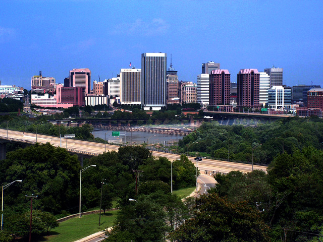
I chose to comment this photo because I could see a few problems with it.
1. The photograph is noisy. You can see this mostly where the blue skies meet the buildings.
2. No definite subject.
3. It's very flat. The time of day is crucial for this, as everything seems 2dimensional. Theres no playing with the shadows/highlights, and it gives it the overall flat look
How could you improve the photo...
Depending how the buildings face, you could go either early am or an hour before sunset. Zoom in and crop! The entire bottom half of the photograph is unneccessary and takes away from the photo.
Keep taking photos! Different positions, try scouting different spots around the city for different views of the skyline. |
|
 Photographer found comment helpful. Photographer found comment helpful. |
|
|
08/30/2006 09:02:22 AM |
I was always jealous of the people that lived in that building. Though, I must admit -- I was a Fan Rat. I have many fond memories of cruising around the Fan on a bike at 3am in the morning. And the alleys -- the alleys there are just such a dichotmy with the house fronts -- it's a thrill seeing through the veneer of upper-class Fan into the seedy underbelly.
|
|
| Photographer found comment helpful. |
Comments Made During the Challenge  |
|
|
08/28/2006 04:16:51 PM |
Actually, this is where I was missing all that time. I got so drunk in a bar that I could not find my way to a bathroom and wandered around 40 days and 40 nights looking for one. That is hard to explain to people so that is why I make up a story about being lost in the desert. People lack sympathy for drunks that can't find a bathroom.
Good cityscape. It contains buildings, park and water and makes the city look very appealing. Unsure what is going on in the water but it adds interest to the image. Might want to try a little more sharpening to bring out that nice building and tree detail and apply a litle noise reduction to the sky.
I like the image. - Steve |
|
| Photographer found comment helpful. |
|
|
08/26/2006 09:58:25 AM |
| There's a pink tint in the road and buildings on my monitor. Also might be some artifacts, or else I'm wrong :-) It's a attractive cityscape composition, though. |
|
| Photographer found comment helpful. |
|
|
08/26/2006 06:30:47 AM |
| Now this is a scene I haven't seen for a long time. |
|
| Photographer found comment helpful. |
|
|
08/25/2006 10:00:24 AM |
| So he's been chopped up and all his parts scattered, huh? And just how do you know this? This way for questioning please! LOL. Nice shot. 6 |
|
| Photographer found comment helpful. |
|
|
08/24/2006 08:18:00 AM |
| I'm not sure what it is about this image but it seems very.. strange, like pieces don't really belong. Maybe its simply the brightness of the ambient light making the buildings stand out from the sky.. not sure. I think this is a good urban image, it has a nice layout and includes nearly everything I'd think of when thinking about a cityscape. Obviously meets the challenge. The focus looks good, the composition is good but still seems a trifle odd. Its a nice image but doesn't really inspire me to invest much time looking. I gave a 5 |
|
| Photographer found comment helpful. |
Home -
Challenges -
Community -
League -
Photos -
Cameras -
Lenses -
Learn -
Help -
Terms of Use -
Privacy -
Top ^
DPChallenge, and website content and design, Copyright © 2001-2025 Challenging Technologies, LLC.
All digital photo copyrights belong to the photographers and may not be used without permission.
Current Server Time: 04/07/2025 04:25:02 AM EDT.