| Author | Thread |
|
|
09/12/2006 08:15:22 PM |
Critique Club Review:
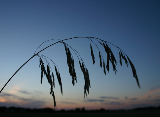
Focus, sharper is better, escpecially for silhouettes. The grass runs into the skyline of the town, which distracts a bit. Color saturation and hue are all fine.
You've already heard from the rule of thirds police. The rule can be broken, but it's best to have a reason in mind when you do.
I like the arch of the grass. I think no town, and maybe even no clouds, could have made it pop even more. (I'm thinkin a few minutes later in the evening where a timed exposure could have lightened the sky a bit, and captured a few stars, might have made for an interesting effect.) |
|
Comments Made During the Challenge  |
|
|
09/05/2006 07:28:36 AM |
| too simple. no 1/3rd rule apply... |
|
|
|
09/02/2006 01:58:49 AM |
| Nice composition. This would be a really great shot with more depth. |
|
|
|
08/31/2006 09:52:38 AM |
| I like the curves and the idea, but I think it could be a better shot with all the grass in focus and without the landscape. |
|
|
|
08/31/2006 09:22:50 AM |
|
|
|
08/30/2006 10:56:16 PM |
| I like the simplicity of your image.. |
|
|
|
08/30/2006 07:10:36 PM |
| Nice subject, but I think the framing/angle could have been done slight more interestingly. It is rather static this way. Also wish that the bottom fringe wasn't touching the treeline. |
|
|
|
08/30/2006 09:24:15 AM |
|
Home -
Challenges -
Community -
League -
Photos -
Cameras -
Lenses -
Learn -
Help -
Terms of Use -
Privacy -
Top ^
DPChallenge, and website content and design, Copyright © 2001-2025 Challenging Technologies, LLC.
All digital photo copyrights belong to the photographers and may not be used without permission.
Current Server Time: 03/12/2025 01:32:41 AM EDT.