| Author | Thread |
|
|
09/13/2006 06:57:45 PM |
Critique Club Review:
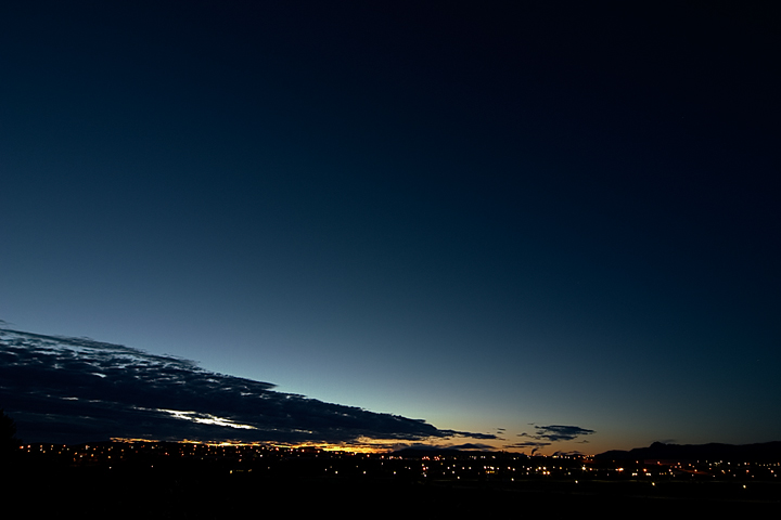
Focus is nice and sharp.
Color, saturation and hue are done well. Contrast is good. About the only thing I see in this picture that you might want to change, is to crop out some of the sky. There is so much negative space there, and it goes dark all across the top a little early, so that the negative space dominates the picture. If you cropped almost halfway down, you would still get the full range of colors in the sky. The darkness of the sky would not complete with the foreground, and it would be an interesting panoramic view.
As it is, it is still a very pretty picture that does well to communicate the stillness of first light in the morning. Nice job. |
|
 Photographer found comment helpful. Photographer found comment helpful. |
Comments Made During the Challenge  |
|
|
09/03/2006 06:49:40 PM |
-An interesing way you framed this... I think this crop would be more effective if the whole sky had the clouds in it, to give the photo more depth
-Good exposure, nice colors
-Score: 6 |
|
| Photographer found comment helpful. |
|
|
09/02/2006 09:41:19 PM |
| i think theres too much negative space at the top but great colors. |
|
| Photographer found comment helpful. |
|
|
09/02/2006 05:07:44 PM |
| Minimalist and very nice. |
|
| Photographer found comment helpful. |
|
|
09/02/2006 08:41:00 AM |
|
| Photographer found comment helpful. |
|
|
09/01/2006 07:35:31 PM |
And the sky is....????????
Sorry to much sky. |
|
Home -
Challenges -
Community -
League -
Photos -
Cameras -
Lenses -
Learn -
Help -
Terms of Use -
Privacy -
Top ^
DPChallenge, and website content and design, Copyright © 2001-2025 Challenging Technologies, LLC.
All digital photo copyrights belong to the photographers and may not be used without permission.
Current Server Time: 03/12/2025 08:28:45 PM EDT.