Critique Club Review:
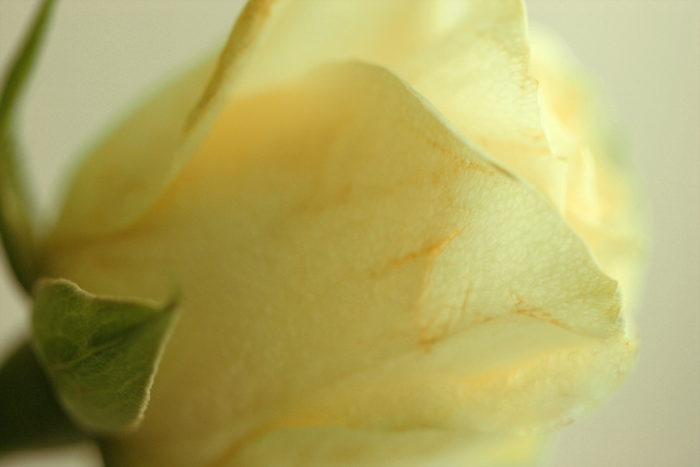
Color, saturation, hue, and contrast are all good. I would have liked a bit brighter image. I see you did this in a tent, but it reminds me of an overcast or cloudy day. I think going with a soft focus filter, would have worked better than the shallow depth of field. As is the green competes with the pastel of the yellow. Lightening the green might work well too. I know you wanted a shallow depth of field, but the top of the bloom (right side) on the far side of the flower just sort of merges with the background. Had the background been a different color, or the flower a little sharper, this wouldn't happen.
The biggest distraction, because it is in the more sharply focused area, is the browning markings on the petals. While this might be a natural marking of the flower, the impression it gives me is a flower that has been over handled, or an older flower that is starting to deteriorate. If it is markings, a sharper image, with more depth of field would have communicated this. If the flower is deteriorating, or over handled and bruised, then the soft focus could have covered up the problem.
Overall this is an enjoyable picture. Nice job. |