| Author | Thread |
Comments Made During the Challenge  |
|
|
09/30/2003 05:06:34 PM |
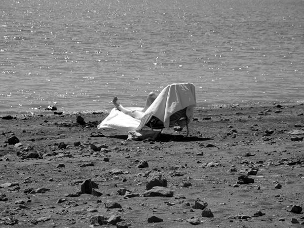
| Interesting that the topic of the shot is the least defined/focused. Was that intentional? It's definitely an interesting look. |
|
|
|
09/30/2003 01:40:46 PM |
| nice! I love how the chair is completely in center frame - black and white totally appropriate. |
|
|
|
09/30/2003 03:00:50 AM |
| MIght have cropped it higher or lower so the waterline doesn't cut the photo in half. |
|
|
|
09/29/2003 11:49:03 PM |
| I like the contrast of the rocky beach and the rippling water. The contrast is about right but it could use some sharpening. The sunbather needs be closer to the right side of the frame. Two sunbathers would be even better. |
|
|
|
09/27/2003 11:31:09 PM |
| Not a very inviting beach 'eh? |
|
|
|
09/27/2003 06:18:16 PM |
| I think this would have worked better if the subject wasn't right in the centre of the picture. |
|
|
|
09/27/2003 02:43:37 AM |
| Good contrast make the seated subject pop out of the picture. Love the shadows that you were able to capture in the rocks. It makes it feels that you are there. The great depth of field gives a calming effect. Would make a great postcard. |
|
|
|
09/26/2003 11:57:02 AM |
| I would bring the subject down closer to the bottom right. |
|
|
|
09/25/2003 07:20:04 AM |
| This is a great shot. I think it would have been even more interesting had you off-centered your subject to the right a little. |
|
|
|
09/24/2003 10:19:07 PM |
| Too centered....maybe some more contrasts... |
|
|
|
09/24/2003 07:09:59 PM |
|
|
|
09/24/2003 10:10:51 AM |
| I like your shot. I do think she should of been a bit off center. Just seems to needs something... |
|
|
|
09/24/2003 05:38:04 AM |
| The rule of thirds would have helped this image I think. I do like the slant of the chair so that all you see is the leg. |
|
Home -
Challenges -
Community -
League -
Photos -
Cameras -
Lenses -
Learn -
Help -
Terms of Use -
Privacy -
Top ^
DPChallenge, and website content and design, Copyright © 2001-2025 Challenging Technologies, LLC.
All digital photo copyrights belong to the photographers and may not be used without permission.
Current Server Time: 03/13/2025 03:00:28 AM EDT.