| Author | Thread |
|
|
02/29/2008 04:46:29 AM |
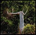
beyond the fact that this is 2 trees (and the fact that had you not mentioned it in the title, far less people would have noticed), a couple of comments:
I like very much the composition, and silhouette against the sun (I gave it a 6). The only thing that could be improved I think are the technicals.
First, given the high luminosity, you should have set the ISO to 100. As a general rule, your picture will always look better at low iso, so increasing iso is the last thing you do.
At iso 100, with the same aperture, the shutter speed would have been 1/125. But in any case, you could easily have increased the aperture (to f/8.0 or lower) if 1/125s was not enough. Aperture like f/13 are only required if you want to have a large depth of field, which is not the case here. Furthermore, as a general rule, lenses give their best result at aperture 8-11 (4-11 or even lower for the best ones that can have high apertures of 2.8 or lower).
Finally, I think anyway your settings points to too bright an exposure. The sun seems "burnt" and the light is covering the smaller branches of the tree. This would have less been the case if settings had been set so that light was reduced.
|
|
Comments Made During the Challenge  |
|
|
09/13/2006 02:56:29 AM |
D'oh! if you hadn't titled it "twins" i probably wouldn't have noticed that it didn't meet the challenge! the silhouette against the yellow is nice, though the blacks turn orange on some of the branches, which kind of lessens the very asain block wall paper type stamp vibe i got with it. also , the sky at the top of the shot turns a rather unsightly shade of grey, but i guess there was little you could do with that. it's a pretty shot, i like the centred composition, and i like the delicate nature of the tree... just doesn't set my pants alight.
my new system of scoring: composition + technical 2/3, challenge 0.5/1, post processing results 1/2, ooooh factor 1/4 = 4.5 (well, 5) |
|
 Photographer found comment helpful. Photographer found comment helpful. |
|
|
09/13/2006 12:26:59 AM |
|
|
|
09/12/2006 11:10:34 PM |
| Oh no two trees!!!! lol good work |
|
| Photographer found comment helpful. |
|
|
09/12/2006 12:44:51 PM |
| I like the minimalist nature of this shot. Well done! |
|
| Photographer found comment helpful. |
|
|
09/12/2006 10:48:34 AM |
| Pretty colours and nice symmetry. The focus seems a little soft. I may be wrong. |
|
| Photographer found comment helpful. |
|
|
09/12/2006 06:08:30 AM |
| Not a single tree, but like it none the less |
|
| Photographer found comment helpful. |
|
|
09/11/2006 09:49:02 PM |
| nice one - colors, silhouette, framing. 8 |
|
| Photographer found comment helpful. |
|
|
09/11/2006 03:33:35 PM |
| I hate saying this but for me this just doesn't do it. I feel like you went half way with the PP on this one. It's wither too crips or not crisp enough. I feel like you were going for a more artistic slant on this one and it just didn't quite get there for me. |
|
| Photographer found comment helpful. |
|
|
09/11/2006 12:37:11 PM |
| This lacks the crispness of focus that would make this more pleasing to view. |
|
| Photographer found comment helpful. |
Home -
Challenges -
Community -
League -
Photos -
Cameras -
Lenses -
Learn -
Help -
Terms of Use -
Privacy -
Top ^
DPChallenge, and website content and design, Copyright © 2001-2025 Challenging Technologies, LLC.
All digital photo copyrights belong to the photographers and may not be used without permission.
Current Server Time: 04/26/2025 02:38:20 AM EDT.