| Author | Thread |
|
|
09/25/2006 09:03:58 PM |
Critique Club Review:
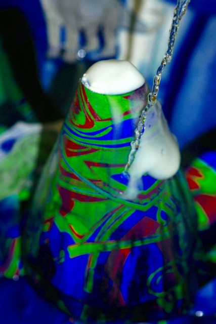
I'm not sure what the stream of water is supposed to represent. To the left of the cone, it looks like there is a spot or drop of water on the lens.
Color and saturation are good. The foam at the top of the volcano is just about burned out and featureless. Could just be the foam is.
Depth of field is a little shallow here. Things are getting soft towards the base of the cone.
To me it appears that you are a little too close to the cone with the camera. Also a little late with the picture. It looks like the eruption is about over.
This is a creative take on the challenge. I'd like to see this picture again with a little wider angle, more depth of field, the eruption in mid flow for a little more drama and without the stream of liquid frozen in time, it is a little distracting. |
|
Comments Made During the Challenge  |
|
|
09/19/2006 04:58:32 PM |
| Great color effects. I vote 9. |
|
|
|
09/13/2006 11:50:35 PM |
| Nice use of color, but a bit of a stretch for the challenge |
|
|
|
09/13/2006 08:58:28 PM |
| I like the 'volcano' nice colours. Just the stream of liquad in front throws me. I understand what it is and what its for, just looks like you missed the target. |
|
|
|
09/13/2006 10:41:27 AM |
| That fits the bill. But it needs better focus and composition. |
|
|
|
09/13/2006 02:25:16 AM |
| Not in focus enough for me. |
|
Home -
Challenges -
Community -
League -
Photos -
Cameras -
Lenses -
Learn -
Help -
Terms of Use -
Privacy -
Top ^
DPChallenge, and website content and design, Copyright © 2001-2025 Challenging Technologies, LLC.
All digital photo copyrights belong to the photographers and may not be used without permission.
Current Server Time: 03/12/2025 12:54:18 PM EDT.