| Author | Thread |
Comments Made During the Challenge  |
|
|
09/17/2006 09:25:54 PM |
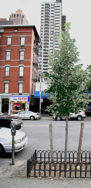
| Good idea but your tree does not stand out enough from the background. |
|
|
|
09/17/2006 07:32:34 PM |
| Great photo. Some of the elements in the photo are distracting. I would edit out the cars and do a blur effect on the buildings in the background. A bit of color in the sky would also bring the tree to the attention of the viewer. These are only suggestions. You have an amazing photo with or without editing. Nice job. |
|
|
|
09/14/2006 06:23:49 PM |
| I see where you're going with this, but I find my attention on the buildings rather than the tree. Or is that the point? |
|
 Photographer found comment helpful. Photographer found comment helpful. |
|
|
09/13/2006 11:01:44 AM |
| the lighting hurts the pic. the tree looks overexposed, so it doesn't contrast well against the sky, building. |
|
| Photographer found comment helpful. |
|
|
09/12/2006 10:58:04 AM |
| Good sense of humour and neatly photographed composition. |
|
| Photographer found comment helpful. |
|
|
09/11/2006 05:37:10 PM |
| love the sushi sign in the bg :) something about the post looks off. looks like you took out something, maybe? this would look really great with a nice green pop to the leaves. |
|
| Photographer found comment helpful. |
|
|
09/11/2006 04:33:40 PM |
| the buildings in the BG seem to be falling over, and draw all the attention away from that poor tree |
|
| Photographer found comment helpful. |
|
|
09/11/2006 05:39:52 AM |
| It gets lost in the building behind it. It might have shown up better against the red building. |
|
| Photographer found comment helpful. |
|
|
09/11/2006 05:36:18 AM |
| crop at right is too tight |
|
| Photographer found comment helpful. |
|
|
09/11/2006 12:49:08 AM |
| I'm not sure if the muted colors were an intensional choice, but I find them a little lackluster. It gives the tree a strange quality. It looks like maybe you used a flash and that gives the tree a somewhat plastic look. If you had maybe turned around and gotten to the other side of the tree and shot against a more simple background it might also strengthen it. I like the concept though. |
|
| Photographer found comment helpful. |
Home -
Challenges -
Community -
League -
Photos -
Cameras -
Lenses -
Learn -
Help -
Terms of Use -
Privacy -
Top ^
DPChallenge, and website content and design, Copyright © 2001-2025 Challenging Technologies, LLC.
All digital photo copyrights belong to the photographers and may not be used without permission.
Current Server Time: 03/11/2025 02:57:40 PM EDT.