| Author | Thread |
Comments Made During the Challenge  |
|
|
09/12/2006 11:23:47 PM |
|
 Photographer found comment helpful. Photographer found comment helpful. |
|
|
09/12/2006 03:33:15 PM |
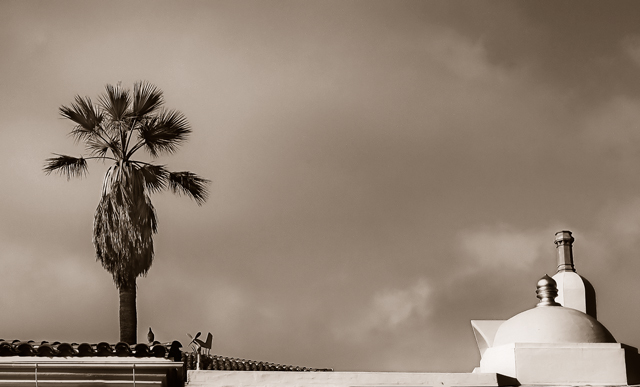
| like the processing, tree and rigth side of building. I don't like seeing the rooftop on the left. I think the comp would be improved if the two vertical pieces were closer together (different POV?) but as it is they look lost with so much space between them. |
|
| Photographer found comment helpful. |
|
|
09/11/2006 01:43:58 PM |
| One's eye tends to go to areas of high contrast and brightness first in an image. For this image it means that the shapes in the lower right hand corner are dominant....not your intention, I'm sure. |
|
| Photographer found comment helpful. |
|
|
09/11/2006 11:42:42 AM |
| Nice sepia tone. Works wonders for this photo. |
|
| Photographer found comment helpful. |
Home -
Challenges -
Community -
League -
Photos -
Cameras -
Lenses -
Learn -
Help -
Terms of Use -
Privacy -
Top ^
DPChallenge, and website content and design, Copyright © 2001-2025 Challenging Technologies, LLC.
All digital photo copyrights belong to the photographers and may not be used without permission.
Current Server Time: 03/12/2025 09:50:05 AM EDT.