| Author | Thread |
|
|
09/20/2006 08:43:05 PM |
Critique Club Review:
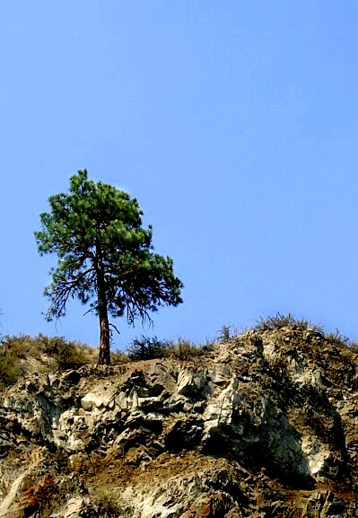
Color is good. Saturation and hue are well done.
I'm not quite sure what happened in the sky. Could be over compression of your software creating the jpeg. The upper right of teh sky just looks "splotchy".
At the top of the tree, just to the right of center, it looks like smoke or the edge of a cloud and comes across as a little too loose a hand while editing.
I like the texture of the rock face. You can almost reach out and touch them.
However, the tree is overwhelmed in this picture and comes across a bit small and there is just too much featureless sky. The sky is a pretty blue, but there is so much bright empy space there that it hurts the rest of the picture a bit.
|
|
 Photographer found comment helpful. Photographer found comment helpful. |
Comments Made During the Challenge  |
|
|
09/12/2006 10:47:48 AM |
| Nice blue (it has artifacts in it though) and the rocks are good. The light is on the bright side. |
|
| Photographer found comment helpful. |
Home -
Challenges -
Community -
League -
Photos -
Cameras -
Lenses -
Learn -
Help -
Terms of Use -
Privacy -
Top ^
DPChallenge, and website content and design, Copyright © 2001-2025 Challenging Technologies, LLC.
All digital photo copyrights belong to the photographers and may not be used without permission.
Current Server Time: 03/12/2025 09:41:01 AM EDT.