| Author | Thread |
|
|
09/23/2006 09:08:42 AM |
Originally posted by ambaker:
Critique Club:
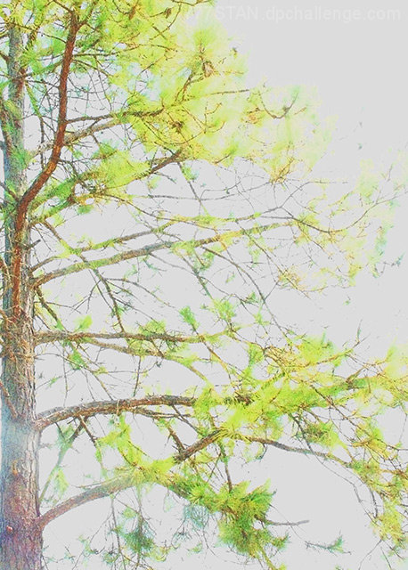
Hard to say what happened here. But it is much too bright. The lower left third of the frame, the glare makes it look as if it were shot through a window into the sun.
The unusual colors, and the way some of the limbs run parallel, it almost appears to be a double exposure. But under close inspection it appears not to be the problem either.
Color, saturation, and hue appear to be way off; if a realistic rendition were intended. But there isn't enough there to tell the viewer an abstract interpretation is required. Brightness is too bright, contrast is a bit low.
The sky has become washed out and a blank canvas, just begging for detail such as clouds or a brilliant blue color.
I'm thinking this picture might work better in black and white, with a bit more contrast it would wind up looking like a Japanese ink drawing. |
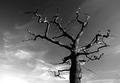
Thanks! I tend to agree! Here it is!
Message edited by author 2006-09-23 09:10:18. |
|
|
|
09/23/2006 08:48:13 AM |
This photo is washed out for too reasons, one foolish...one logical. I was "testing the waters" of everyone's opinions & monitors as to the far edge of saturation. (Thanks loads! I found out because this is my only last place finish!)
Secondly, I wanted the details you see in the trunk which made the needles look "unnatural." SOL :( |
|
|
|
09/23/2006 03:13:26 AM |
Critique Club:
Hard to say what happened here. But it is much too bright. The lower left third of the frame, the glare makes it look as if it were shot through a window into the sun.
The unusual colors, and the way some of the limbs run parallel, it almost appears to be a double exposure. But under close inspection it appears not to be the problem either.
Color, saturation, and hue appear to be way off; if a realistic rendition were intended. But there isn't enough there to tell the viewer an abstract interpretation is required. Brightness is too bright, contrast is a bit low.
The sky has become washed out and a blank canvas, just begging for detail such as clouds or a brilliant blue color.
I'm thinking this picture might work better in black and white, with a bit more contrast it would wind up looking like a Japanese ink drawing. |
|
 Photographer found comment helpful. Photographer found comment helpful. |
Comments Made During the Challenge  |
|
|
09/17/2006 08:27:55 PM |
| I think something went wrong when this was saved for the web. |
|
| Photographer found comment helpful. |
|
|
09/16/2006 08:27:32 AM |
| Nice idea on the composition but the photo is blown out to the point it is very hard to judge. You must have been shooting into the sun. Next time you may want to try shooting with the sun to your left to get more detail and it will help loose the sun glare. |
|
| Photographer found comment helpful. |
|
|
09/15/2006 12:00:24 PM |
| WOW This is really blown out! everything is washed out and the colors look unnatural. |
|
| Photographer found comment helpful. |
|
|
09/13/2006 09:20:42 AM |
|
| Photographer found comment helpful. |
|
|
09/13/2006 08:35:16 AM |
| I think this was taken at too high an aperture. It appears you may have been compensating a dark image by trying to lighten it. Left signature artifacts. Compensating exposure by a few stops down, and using a tripod for slower shutter speed would have given a cleaner image. |
|
| Photographer found comment helpful. |
|
|
09/13/2006 07:40:49 AM |
| really washed out colour and lack of detail |
|
| Photographer found comment helpful. |
|
|
09/13/2006 03:23:54 AM |
| hey mate; this looks like its washed out |
|
| Photographer found comment helpful. |
|
|
09/11/2006 09:28:45 PM |
| "regal" suggests to me royal colours such as dark puple, gold, etc. What shows on my laptop (ugggg) monitor is glare. not sure if there is a haze/fog/something from left running downward into bottom center of frame? but the needles are lemon green and trunk is washed out light grey/neutral. 5 because it does meet the challenge..gl :-) |
|
| Photographer found comment helpful. |
|
|
09/11/2006 09:18:23 PM |
| Don't care for the crop. Not sure what the inteded effect was. |
|
| Photographer found comment helpful. |
|
|
09/11/2006 08:58:27 PM |
| Hi key look doesn't quite work on this. |
|
| Photographer found comment helpful. |
|
|
09/11/2006 08:51:20 PM |
| much too overexposed for my taste |
|
| Photographer found comment helpful. |
|
|
09/11/2006 12:30:47 PM |
| That pine is lime green! Never seen one like that in my life. The positioning of the tree in your photo is rather good. I would just prefer no lens flare and deeper colours. |
|
| Photographer found comment helpful. |
|
|
09/11/2006 12:06:40 PM |
| High key is interesting but the foggy area on the trunk and the too blown-out branches in the upper right corner keep me from wanting to stay with this image and explore its detail. |
|
| Photographer found comment helpful. |
|
|
09/11/2006 09:45:49 AM |
| Sorry, the overexposure is not appealing to me. |
|
| Photographer found comment helpful. |
|
|
09/11/2006 12:50:51 AM |
| This overexposure could have been effective if there wasn't the bright slash of light in the left side. It's really distracting. Try increasing the saturation a little and cloning out the bright spot and this could be a really interesting shot. |
|
| Photographer found comment helpful. |
Home -
Challenges -
Community -
League -
Photos -
Cameras -
Lenses -
Learn -
Help -
Terms of Use -
Privacy -
Top ^
DPChallenge, and website content and design, Copyright © 2001-2025 Challenging Technologies, LLC.
All digital photo copyrights belong to the photographers and may not be used without permission.
Current Server Time: 03/14/2025 03:52:34 AM EDT.