| Author | Thread |
|
|
09/26/2006 02:25:36 AM |
Critique Club Review:
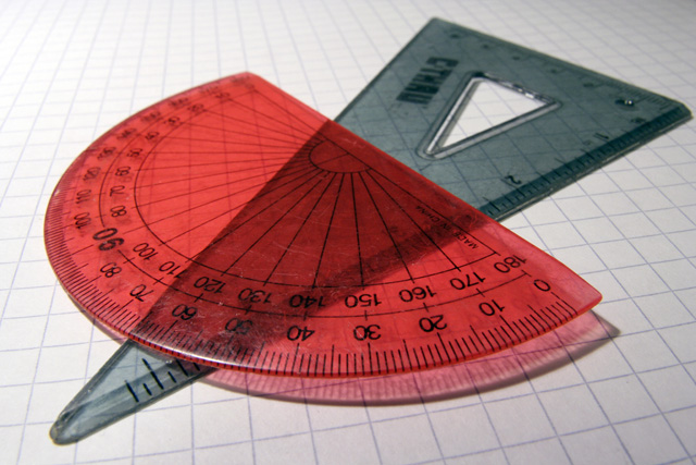
I like the way the graph paper fades towards the back. It helps keep the graph lines from pulling the eye away from the subject.
A little more angle on the light would have emphasized the shadow cast by the protractor. Increasing saturation would have made the red have a little more energy. Not a lot of increase would be needed. "Moderation in all things..."
To make the protractors look newer, wipe them down with a bit of oil. (Cooking oil is fine.) And the buff them dry a bit so they don't stain the paper. Nice glossy finish that washes off with soap and water. Hides minor scratches too.
Interesting photo... |
|
 Photographer found comment helpful. Photographer found comment helpful. |
|
|
09/20/2006 01:44:31 AM |
| Thank you both for the tips! |
|
Comments Made During the Challenge  |
|
|
09/16/2006 04:36:43 PM |
| This is well composed and well executed, I just don't find it very compelling. Maybe a shallower depth of field and deeper contrast would make the colors stand out and make the shot more interesting. |
|
| Photographer found comment helpful. |
|
|
09/13/2006 08:49:43 AM |
| Good composition, I like that you used graph paper as the background. Lighting could be a bit brighter and more even. |
|
| Photographer found comment helpful. |
Home -
Challenges -
Community -
League -
Photos -
Cameras -
Lenses -
Learn -
Help -
Terms of Use -
Privacy -
Top ^
DPChallenge, and website content and design, Copyright © 2001-2025 Challenging Technologies, LLC.
All digital photo copyrights belong to the photographers and may not be used without permission.
Current Server Time: 03/10/2025 10:34:30 PM EDT.