| Author | Thread |
|
|
09/25/2006 07:26:13 PM |
Critique Club Review:
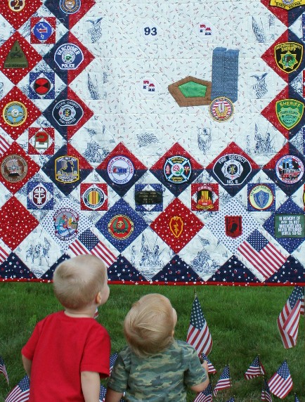
Focus and depth of field are done well.
Color, saturation, and hue are very good. Skin tones are dead on.
I might wish for a smidge brighter picture for a more vivid rendition, but then it may just be my monitor.
I find myself wishing to see more of the quilt, and a little less of the flags down front. They cause a little bit of distraction for me.
Overall a very enjoyable picture. One that I think should have scored a bit higher. |
|
Comments Made During the Challenge  |
|
|
09/18/2006 01:17:11 PM |
| More contrast would be good. |
|
 Photographer found comment helpful. Photographer found comment helpful. |
|
|
09/14/2006 07:36:34 PM |
| A very timely photo, and one that fits the challenge while telling a story: I see a lot of shots that just have shapes but no real sense of geometry, and this is not one of them, and the shot just seems very alive with the interplay of children in the foreground and the shapes in the background. |
|
| Photographer found comment helpful. |
|
|
09/13/2006 11:24:26 AM |
| Nice shapes and angles, good comp |
|
| Photographer found comment helpful. |
Home -
Challenges -
Community -
League -
Photos -
Cameras -
Lenses -
Learn -
Help -
Terms of Use -
Privacy -
Top ^
DPChallenge, and website content and design, Copyright © 2001-2025 Challenging Technologies, LLC.
All digital photo copyrights belong to the photographers and may not be used without permission.
Current Server Time: 04/29/2025 02:15:21 PM EDT.