| Author | Thread |
|
|
09/25/2006 11:19:42 PM |
| This is so comical, and exactly the way my daughter feels about chemistry. Very clever. |
|
 Photographer found comment helpful. Photographer found comment helpful. |
Comments Made During the Challenge  |
|
|
09/19/2006 05:35:56 PM |
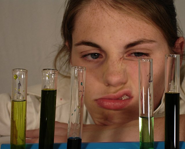
| I like the idea here and the expression on the model is great. In my opinion, what brings it down for me is the dirty test tubes and reflections on model. Also, the test tube rack is tilted downward to the left. |
|
| Photographer found comment helpful. |
|
|
09/19/2006 05:24:02 PM |
Great idea - I think most can relate to this feeling about chemistry!
Lighting and composition could have been better. I would have liked the DOF to capture the student and the vials. |
|
| Photographer found comment helpful. |
|
|
09/19/2006 11:53:26 AM |
| 4 colorful viles and one off color one would have told the story . |
|
| Photographer found comment helpful. |
|
|
09/18/2006 04:53:00 AM |
| I personally would have had the focus on the eyes of the girl and the glasses blurry but not the persone itself. The lighting is ok but is personally would have done a bit of curve working with it in photoshop |
|
| Photographer found comment helpful. |
|
|
09/15/2006 03:56:58 PM |
|
| Photographer found comment helpful. |
|
|
09/15/2006 01:41:30 PM |
| cool expression. the test-tubes are a little bit too "messy" |
|
| Photographer found comment helpful. |
|
|
09/14/2006 08:36:37 PM |
|
| Photographer found comment helpful. |
|
|
09/14/2006 08:27:35 AM |
| Her expression is a little too overexagerrated. I believe it does have to be dramatic enough to convey the "disgruntled" message, but it's too much. Color seems a little too yellow all over. |
|
| Photographer found comment helpful. |
|
|
09/13/2006 11:41:34 PM |
| If the tops of the test tubes were cleaner it would make this a stronger photo. Also, I would bump up the saturation |
|
| Photographer found comment helpful. |
|
|
09/13/2006 10:06:21 PM |
| Fun look, but seems a bit flat overall. Need to see something else going on maybe. or maybe stronger levels would do the trick. |
|
| Photographer found comment helpful. |
|
|
09/13/2006 10:29:27 AM |
|
| Photographer found comment helpful. |
|
|
09/13/2006 12:15:49 AM |
The white balance is perhaps a little of, and the ligthting a little to soft for my taste. For example this wall behind the girls is probably supposed to be white (?) but it's just a bit red and dull gray.
I like the gap between the glass things (don't know the english word for it), it draws the attention a bit more to her face.
I think the focus should have been set to her face rather than the glass things, or to have her even more out of focus would perhaps work also. |
|
| Photographer found comment helpful. |
Home -
Challenges -
Community -
League -
Photos -
Cameras -
Lenses -
Learn -
Help -
Terms of Use -
Privacy -
Top ^
DPChallenge, and website content and design, Copyright © 2001-2025 Challenging Technologies, LLC.
All digital photo copyrights belong to the photographers and may not be used without permission.
Current Server Time: 03/12/2025 03:34:21 AM EDT.