| Author | Thread |
Comments Made During the Challenge  |
|
|
09/16/2006 02:40:55 PM |
| Her face should have been in focus! |
|
 Photographer found comment helpful. Photographer found comment helpful. |
|
|
09/15/2006 09:17:29 PM |
| I love the idea, but I think you over did it on the mascara, or eye shadow or whatever it was. Try sharping it also. Good try though. You might want to try this one again. |
|
| Photographer found comment helpful. |
|
|
09/13/2006 11:13:48 PM |
| Definately a unique take on the challenge. I like the DOF |
|
| Photographer found comment helpful. |
|
|
09/13/2006 08:56:10 PM |
| not very exciting. Doesn't give me much at all to go with. |
|
| Photographer found comment helpful. |
|
|
09/13/2006 02:58:27 PM |
| Hey! What font is that? (It's kinda ugly). |
|
| Photographer found comment helpful. |
|
|
09/13/2006 10:13:04 AM |
| Rather limited visual interest. I wonder what could have been done to boost the composition. |
|
| Photographer found comment helpful. |
|
|
09/13/2006 01:16:30 AM |
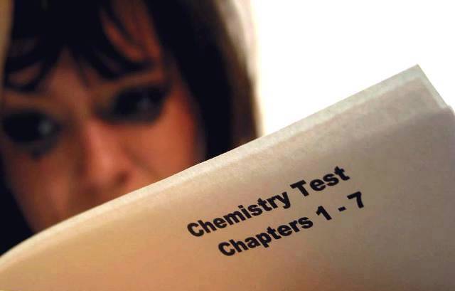
Interesting aprouch, different from everything I have seen so far.
The background is to white, it draws to much attention to it. Perhaps a white background isn't the right choice if she's supposed to be in a classroom ?
The test might be a little bit brighter though and her face, but that's perhaps just because of the bright background.
Her face is also a bit to red, isn't it ? |
|
| Photographer found comment helpful. |
|
|
09/13/2006 12:48:00 AM |
|
| Photographer found comment helpful. |
Home -
Challenges -
Community -
League -
Photos -
Cameras -
Lenses -
Learn -
Help -
Terms of Use -
Privacy -
Top ^
DPChallenge, and website content and design, Copyright © 2001-2025 Challenging Technologies, LLC.
All digital photo copyrights belong to the photographers and may not be used without permission.
Current Server Time: 03/12/2025 07:52:39 PM EDT.