| Author | Thread |
|
|
10/13/2006 04:43:14 PM |
Composition:
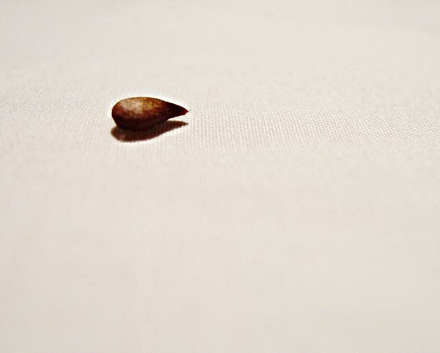
I like your choice of background colour but feel the seed should be more off to the left with less room at the bottom. A bit like this but with more room on the right I think....

Technicals:
Good use of DOF to select just the section of the image with the seed in to be in focus but (unless its my eyes) the seed itself looks out of focus? The lighting on the seed is good and I feel you have managed the whites in the well.
Just my opinion :o)
|
|
 Photographer found comment helpful. Photographer found comment helpful. |
Comments Made During the Challenge  |
|
|
09/24/2006 08:34:43 PM |
| it's simple, but i like it best. |
|
| Photographer found comment helpful. |
|
|
09/22/2006 04:16:30 PM |
| very nice indeed. i just wish the highlight on hte seed was in focus. |
|
| Photographer found comment helpful. |
|
|
09/20/2006 03:25:27 PM |
| i actually really like this photo. Nice composition. Very good macro |
|
| Photographer found comment helpful. |
|
|
09/19/2006 02:56:42 PM |
| The seed looks too dark. The minimalism is great. |
|
| Photographer found comment helpful. |
Home -
Challenges -
Community -
League -
Photos -
Cameras -
Lenses -
Learn -
Help -
Terms of Use -
Privacy -
Top ^
DPChallenge, and website content and design, Copyright © 2001-2025 Challenging Technologies, LLC.
All digital photo copyrights belong to the photographers and may not be used without permission.
Current Server Time: 03/12/2025 02:39:26 AM EDT.