| Author | Thread |
Comments Made During the Challenge  |
|
|
10/07/2003 08:08:58 PM |
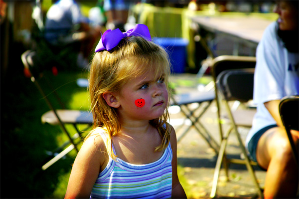
Something is off with the colors. The grass has too much yellow and her bow seems neon. Also, the background is busy with all of the chairs and the lady on the right is cut off. I think a tighter crop on the girl would work well here.
Cute girl. Good attempt. |
|
|
|
10/07/2003 07:52:59 AM |
whooooooo I think we have a winner. Superb capture!!!!!!!! dof is spot on, but the black is distracting on the left - can't be helped I bet but cropping would have sorted it.
Best of luck! |
|
|
|
10/06/2003 08:16:07 PM |
| Good concept... perhaps a little too much colour saturation? |
|
|
|
10/03/2003 08:19:00 PM |
| Closer than some to irony. Overall, I like the technical elements of the shot, though I think it would have been more effective closer in - the pumpkin would have been more prominant. "what irony" in the title is a little too blunt. |
|
|
|
10/03/2003 12:42:22 PM |
| Good color, I like the depth of field. |
|
|
|
10/02/2003 09:10:50 PM |
|
|
|
10/02/2003 12:24:15 PM |
| I like the lighting and the DOF, I think this would be a better picture of an unhappy little girl without the face painting |
|
|
|
10/01/2003 07:26:59 PM |
| Looks more like a pissed off face. Cute, but the bow seems overexposed. |
|
|
|
10/01/2003 07:03:00 PM |
| base 1: 1/1; challenge: 1/3; technical: 1/3; aesthetics: 0/3; total: 3 |
|
|
|
10/01/2003 07:00:41 PM |
| Congratulations on being one of the few who know what irony means, while making a visualy attractive photo. There are just two criticisms: 1) I wish you titled the photo something else so as to not spell out the irony - but it's still good. 2) The contrast seems a bit high. |
|
|
|
10/01/2003 01:23:27 PM |
| Great shot, but could have cropped right and left. [8] |
|
|
|
10/01/2003 01:17:24 PM |
| Not too happy are we? I think I would have liked this better if she was a little more off center. Great expresion though. |
|
|
|
10/01/2003 11:52:32 AM |
| Cropping more of the little one would have helped. |
|
|
|
10/01/2003 09:55:49 AM |
| Yes that is irony but the shot seems off somehow. The bow on her head looks to perfect and almost looks like it was placed in afterwards. |
|
|
|
10/01/2003 09:06:17 AM |
| Somewhat ironic - I would have cropped out most of the unrelated objects |
|
|
|
10/01/2003 08:10:31 AM |
| Great job on the tones here, they work perfectly! I think this shot looks great. |
|
|
|
10/01/2003 06:54:23 AM |
| Sweet portrait. You've blurred out the background well, however it still gives me a kind of busy feeling. What is the redness on the girls lower arm and the woman's leg, it seems this is vignetting somehow. |
|
|
|
10/01/2003 12:54:53 AM |
| I like the color work here. There's irony too, which seems pretty rare this challenge. Great job. |
|
Home -
Challenges -
Community -
League -
Photos -
Cameras -
Lenses -
Learn -
Help -
Terms of Use -
Privacy -
Top ^
DPChallenge, and website content and design, Copyright © 2001-2025 Challenging Technologies, LLC.
All digital photo copyrights belong to the photographers and may not be used without permission.
Current Server Time: 03/12/2025 07:55:30 PM EDT.