| Author | Thread |
|
|
10/01/2006 01:22:43 AM |
Critique Club Review:
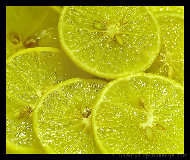
Color does seem a bit off. The parts that should be white, aren't which I think has people seeing green for some reason.
Lighting as others have mentioned is a bit harsh, and combined with the processing leaves the picture looking almost as if it was over sharpened.
The border does compete with the picture a bit. A lighter touch (thinner border) would have helped here.
The upper left slice, seems a bit shadowed as it does not have highlights similar to the other slices.
Focus and depth of field are very good. |
|
 Photographer found comment helpful. Photographer found comment helpful. |
Comments Made During the Challenge  |
|
|
09/23/2006 05:02:39 PM |
| Composition is well placed. Image seems a bit green, but that is probably my monitor. Anyway, overall a good shot. |
|
| Photographer found comment helpful. |
|
|
09/21/2006 09:42:20 AM |
| Would have been better without that border. |
|
| Photographer found comment helpful. |
|
|
09/19/2006 11:23:23 PM |
| Very brilliant color and nice texture. |
|
| Photographer found comment helpful. |
|
|
09/19/2006 07:10:44 PM |
| Refreshing looking subject and nicely clean too. |
|
| Photographer found comment helpful. |
|
|
09/19/2006 05:53:47 PM |
| The picture is too green on my monitor. Lemons should be YELLOW!! |
|
| Photographer found comment helpful. |
|
|
09/18/2006 07:29:52 PM |
| I like your idea but the light is too hard IMHO. Try to soften it using thin paper, cloth or something similar. |
|
| Photographer found comment helpful. |
|
|
09/18/2006 02:12:01 PM |
| This would make a good poster. |
|
| Photographer found comment helpful. |
|
|
09/18/2006 01:01:53 PM |
| Makes my mouth water just looking at this picture....lol |
|
| Photographer found comment helpful. |
|
|
09/18/2006 10:05:28 AM |
| very good exposure; although your color has a bit too much green for my taste. NICE photo |
|
| Photographer found comment helpful. |
|
|
09/18/2006 07:35:44 AM |
| a tad too green, framing is too much - 7 |
|
| Photographer found comment helpful. |
|
|
09/18/2006 12:15:33 AM |
| great fresh image, my only neg is the yellow line in the frame which really draws your wyw...plain black would have been better 8 |
|
| Photographer found comment helpful. |
Home -
Challenges -
Community -
League -
Photos -
Cameras -
Lenses -
Learn -
Help -
Terms of Use -
Privacy -
Top ^
DPChallenge, and website content and design, Copyright © 2001-2025 Challenging Technologies, LLC.
All digital photo copyrights belong to the photographers and may not be used without permission.
Current Server Time: 03/12/2025 02:29:19 AM EDT.