| Author | Thread |
|
|
09/29/2006 01:10:50 PM |
Greetings from the Critique Club!
Hi Marty,
First of all congratulations on your highest scoring shot to date :o)
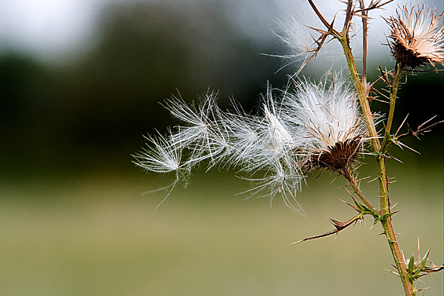
Composition:
I like the placement of the thistle to one side of the frame and the angle of the stem helps lead the viewer to the 'seeds'. I would agree with one of the comments below, the light patches in the background are a little distracting, particularly in the top left. Maybe getting a very slight higher angle and tilting the camera down a little would have enabled you to lose the white parts and just have the greens in the background?
I also think the thistle head on the right would look better if is was completely in the frame, as it is at the moment it leaves me wishing I could see the rest of it.
Technicals:
Excellent DOF, the blurred dark greens really help the white of the 'seeds' stand out. You have captured some lovely detail and textures in the stem and thistle heads but I do think it could do with being sharpened a little.
Hope this helps.
If you've got any questions about this critique, please feel free to contact me via the PM system.
- Natalya :o) |
|
 Photographer found comment helpful. Photographer found comment helpful. |
Comments Made During the Challenge  |
|
|
09/24/2006 10:06:23 AM |
|
| Photographer found comment helpful. |
|
|
09/24/2006 01:44:33 AM |
| Amazing capture. I enjoyed this photograph. |
|
| Photographer found comment helpful. |
|
|
09/19/2006 11:19:50 PM |
| pretty textures, nice blurred background. |
|
| Photographer found comment helpful. |
|
|
09/19/2006 03:11:23 AM |
| tender, nut the lights in teh backgound could be missed |
|
| Photographer found comment helpful. |
Home -
Challenges -
Community -
League -
Photos -
Cameras -
Lenses -
Learn -
Help -
Terms of Use -
Privacy -
Top ^
DPChallenge, and website content and design, Copyright © 2001-2025 Challenging Technologies, LLC.
All digital photo copyrights belong to the photographers and may not be used without permission.
Current Server Time: 03/12/2025 03:25:19 AM EDT.