| Author | Thread |
Comments Made During the Challenge  |
|
|
08/11/2002 06:56:00 AM |
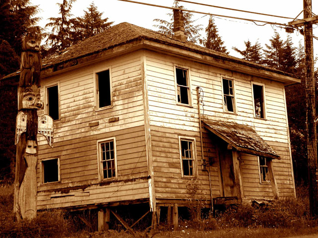
| like the totem pole, composition is a bit awkward |
|
|
|
08/10/2002 12:11:00 PM |
Something old. Use your photographic technique to emphasize the age of your subject.
Composition - good
Technical Aspects - quite good
Meets Challenge - yes
Visual Impact / Originality - good , though my first reaction is "poor", not old.
|
|
|
|
08/10/2002 03:04:00 AM |
| Couldn't you have done more with the totem? |
|
|
|
08/09/2002 09:14:00 PM |
| Pity the photo is at a slight slant.Otherwise it's pretty good. |
|
|
|
08/09/2002 07:10:00 PM |
| very cool. the tinting is very effective here |
|
|
|
08/09/2002 02:53:00 PM |
| Good subject. Totem is too close to the edge of the house, and is hard to mentally distinguish from it. |
|
|
|
08/08/2002 06:20:00 PM |
| I liked it... but to me b/w would look better... |
|
|
|
08/08/2002 09:45:00 AM |
| I like the house with the old totem pole. |
|
|
|
08/07/2002 09:54:00 AM |
| Oh, are you sure you didn't mean to take a close up of that totem pole instead? :-) Neat how the house is tilted like that, but I'm sure others have told you how the power lines are distracting and kind of take away from the oldness of it. Could have been an interesting juxtaposition, but I think they would have had to have been more of a frame. |
|
|
|
08/07/2002 02:23:00 AM |
| Oldest House in Camiguin? |
|
|
|
08/07/2002 12:59:00 AM |
this is kinda cool. looks like its about to fall off the edge of the world. the sepia works great. ~mcmurma
Aesthetics...7
Meets Challenge...7
Overall...7 |
|
|
|
08/06/2002 11:14:00 PM |
| I like the sepia tone. I would have liked to see more of the totem pole. |
|
|
|
08/06/2002 11:09:00 PM |
| The totem pole looks out of place to me, but at the same time, it gives the house a little more character. I like the coloring of this. karmat |
|
|
|
08/06/2002 08:52:00 PM |
| Cool subject. I like the totem on the left. I think this is a good shot, but the one thing that bothers me is the power lines. A tight crop showing only part of the house might be an effective way of cutting out the lines and emphasizing the subject. Composing these can be a tough call, as one might want to include the entire building, but can't without including unwanted distractions. My usual preference is to compose so as to show the most important aspects of the building while eliminating the distracting elements. |
|
|
|
08/06/2002 03:55:00 AM |
| Sepia is a nice choice for this view. |
|
|
|
08/06/2002 12:05:00 AM |
| Hey Matt, very nice pic... I think it's tilted though ;) I put a couple of my outtakes up at pbase.com |
|
|
|
08/05/2002 09:04:00 PM |
| Love the colour! The power line is a bit distracting, however there isn't much you could do about that. Nice. (6) |
|
|
|
08/05/2002 06:32:00 PM |
| My only beef for what is a really good picture is the pole - I'd like to have seen that as the central theme rather than off to the left... Can't knock it technically and it's only one persons beef. (8) |
|
|
|
08/05/2002 02:28:00 PM |
| The utility pole and electricity meter are both kind of distracting. Otherwise, very nice. |
|
|
|
08/05/2002 11:12:00 AM |
| the story on this one is that it looks like it is going o fall over. |
|
|
|
08/05/2002 10:09:00 AM |
| This one looks like its leaning. |
|
|
|
08/05/2002 10:05:00 AM |
|
|
|
08/05/2002 09:56:00 AM |
| The " totem pole" is great---the utility pole and wires are really distracting.Walking around a little more before snapping the pix would have helped. |
|
|
|
08/05/2002 08:54:00 AM |
| Great shot of an old house :) I like the corner view... it gives depth to the subject... Lots of photos like this are done straight on and the image looks flat... good shot :) - jmsetzler |
|
Home -
Challenges -
Community -
League -
Photos -
Cameras -
Lenses -
Learn -
Help -
Terms of Use -
Privacy -
Top ^
DPChallenge, and website content and design, Copyright © 2001-2025 Challenging Technologies, LLC.
All digital photo copyrights belong to the photographers and may not be used without permission.
Current Server Time: 03/12/2025 02:34:05 AM EDT.