| Author | Thread |
Comments Made During the Challenge  |
|
|
09/26/2006 06:13:08 PM |
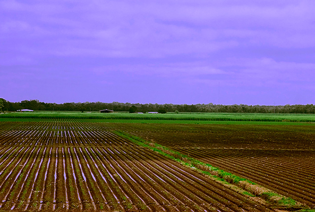
| Good find, good composition. The sky's color doesn't fit in here IMHO. |
|
 Photographer found comment helpful. Photographer found comment helpful. |
|
|
09/21/2006 03:41:50 PM |
| Nice graphics features in there : having only three colors to play with = good. Textures : soil, grass, sky = good. Angle and straight lines = good. Only the horizon in the middle kills it for me. Different cropping would add a lot, losing at least half the sky. Keep going. |
|
| Photographer found comment helpful. |
|
|
09/21/2006 12:33:35 AM |
| Nice colors and lines. Horizon appears to be tilted just a bit down to the right. |
|
| Photographer found comment helpful. |
|
|
09/20/2006 10:12:09 PM |
You certainly have some fine leading lines here, but what are they leading me to?
Things to change that would help improve the photo (imo):
The horizon line is both smack dab in the middle, and also on a slant downwards from left to right. I would crop almost 3/4 of the sky out, as it really doesnt add anything to the photo.
Zoom in, so that the farm or building in the back is larger. There is no real difinitive subject here. |
|
| Photographer found comment helpful. |
|
|
09/20/2006 12:18:12 PM |
| again, lines are strong, but where do they lead? |
|
| Photographer found comment helpful. |
Home -
Challenges -
Community -
League -
Photos -
Cameras -
Lenses -
Learn -
Help -
Terms of Use -
Privacy -
Top ^
DPChallenge, and website content and design, Copyright © 2001-2025 Challenging Technologies, LLC.
All digital photo copyrights belong to the photographers and may not be used without permission.
Current Server Time: 03/12/2025 02:05:14 AM EDT.