| Author | Thread |
|
|
12/03/2007 09:01:31 PM |
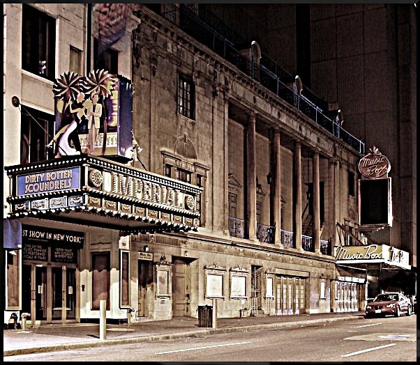
| I think its a little sharp, but I also think without the car you lose part of the story. |
|
|
|
10/15/2006 12:30:20 AM |
| This shot is great. It really shows decay well. The only change I would have made would be to remove the car. |
|
 Photographer found comment helpful. Photographer found comment helpful. |
|
|
10/14/2006 02:27:40 PM |
Critique Club Review:
Nice image!
Yes it is a bit overprocessed in one sense. However, perhaps the opposite is true. It is starting to take on a style seen in the images in magazines and books around the early ninteen hundereds.
I've seen similar styles in my grandmothers old books. I'd recommend cloning out the car, and darkening the building in the background. The architecture there doesn't fit with the architecture of the subject.
The image here is taking on the feel of an illustration as opposed to a straight photograph. I do not feel that everything has to be a straight, detailed rendition of what the photographer saw.
This image appears to me, to be more of what you felt about what you saw. I think I like it better. |
|
| Photographer found comment helpful. |
Comments Made During the Challenge  |
|
|
10/05/2006 02:00:50 AM |
| If that car wasn't there this would look like a post card from the 20's or 30's. Great old building. |
|
| Photographer found comment helpful. |
|
|
10/04/2006 07:34:58 AM |
| ok.. kinda funky processing but I think it works with the subject matter here.. 7 |
|
| Photographer found comment helpful. |
|
|
10/03/2006 10:35:46 AM |
| There's always one car too many in NYC locations. If it is not a blasted car, it is a window a/c unit. Such is life. |
|
| Photographer found comment helpful. |
|
|
10/02/2006 05:28:07 PM |
| very nice composition and an interesting street you've found here...shame about the lone car |
|
| Photographer found comment helpful. |
|
|
10/02/2006 05:38:05 AM |
I like this.
Has a timeless feel to it.
7. |
|
| Photographer found comment helpful. |
|
|
10/01/2006 12:35:58 PM |
| Good, crisp, shot with an old-world feel to it. |
|
| Photographer found comment helpful. |
Home -
Challenges -
Community -
League -
Photos -
Cameras -
Lenses -
Learn -
Help -
Terms of Use -
Privacy -
Top ^
DPChallenge, and website content and design, Copyright © 2001-2025 Challenging Technologies, LLC.
All digital photo copyrights belong to the photographers and may not be used without permission.
Current Server Time: 03/16/2025 07:40:48 AM EDT.