| Author | Thread |
Comments Made During the Challenge  |
|
|
08/10/2002 01:21:00 PM |
|
|
|
08/07/2002 10:57:00 AM |
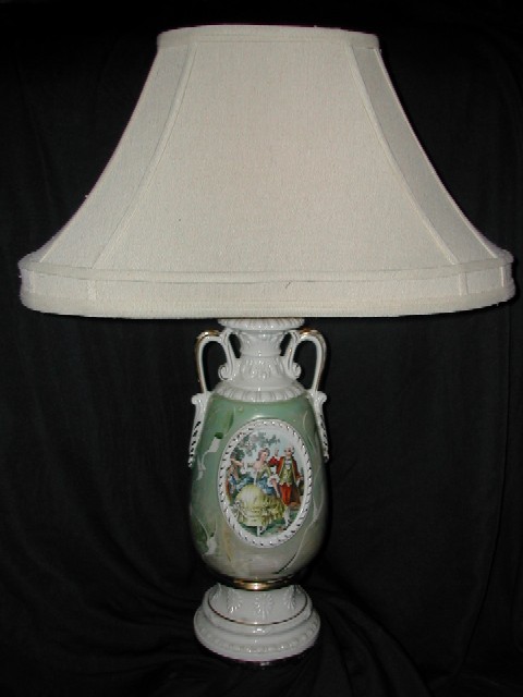
| Drop a little lower to get the top of the vase into the picture. |
|
|
|
08/07/2002 05:12:00 AM |
| Very conventional placement and lighting. Good clear shot and very solid bkac background. Could have been made more interesting by placing a light off to one side and choosing a closer angle. Better to capture the detail on the lamp base than to get everything in. The shade isnt all that interesting so perhaps frame things so we can see it's there but dont show us much of it - focus more on the base detail. |
|
|
|
08/06/2002 04:19:00 PM |
| Good exposure and nice detail with excellent contrast from the low key background. I do have some thoughts that I'll share FWIW. I think the cropping is just a tad tight and that the shade dominates the frame too much. To lessen this I would shoot from furthar back with more zoom so as to compress the elements and lessen the size difference between the base and the shade. This would also bring out more detail in the base, which is lovely and deserving of as much attention as possible. I might also shoot from a slightly lower angle so as to bring the base more into figure (foreground) and the shade more into baackground. |
|
|
|
08/06/2002 09:14:00 AM |
| Nice old lamp but the picture does not excite me. I think the subject should have been in stronger lighting, with the dark background. This would have given the two the opportunity to work together. In my opinion, Autool |
|
|
|
08/05/2002 07:04:00 PM |
This is not working. I'm going to be frank and to the point. It's pretty dull - the lighting definately needs work. The straight-on shot needs to be changed - try a different angle. Personally, I would take one aspect of the lamp - say the woman or the handles, and try to emphasize it. I'm not sure that a black background is ideal for this. I am in no way trying to offend - the best thing is to keep working at it - and take comments with a grain of salt - face value. 3
Ruthann |
|
|
|
08/05/2002 04:05:00 PM |
| This is a neat photo of an old lamp... you did an excellent job of removing a possibly distracting background with the black backdrop. In this particular image, i believe that teh lamp shade could use a little extra 'breathing room' at the top and on the sides... this lamp feels 'cramped' in this space :) - jmsetzler |
|
|
|
08/05/2002 02:29:00 PM |
| Should adjust the balance to darken out the background and bring the lamp's colors more contrast. |
|
|
|
08/05/2002 10:49:00 AM |
| This does meet the challenge, Unfortunately, the photo itself lacks any emotion. It just does not "speak" to me. |
|
|
|
08/05/2002 09:01:00 AM |
| Needs a slight bit more contrast,otherwise very nice picture. |
|
Home -
Challenges -
Community -
League -
Photos -
Cameras -
Lenses -
Learn -
Help -
Terms of Use -
Privacy -
Top ^
DPChallenge, and website content and design, Copyright © 2001-2025 Challenging Technologies, LLC.
All digital photo copyrights belong to the photographers and may not be used without permission.
Current Server Time: 03/12/2025 07:33:19 AM EDT.