| Author | Thread |
|
|
10/08/2006 08:11:24 PM |
Critique Club Review:
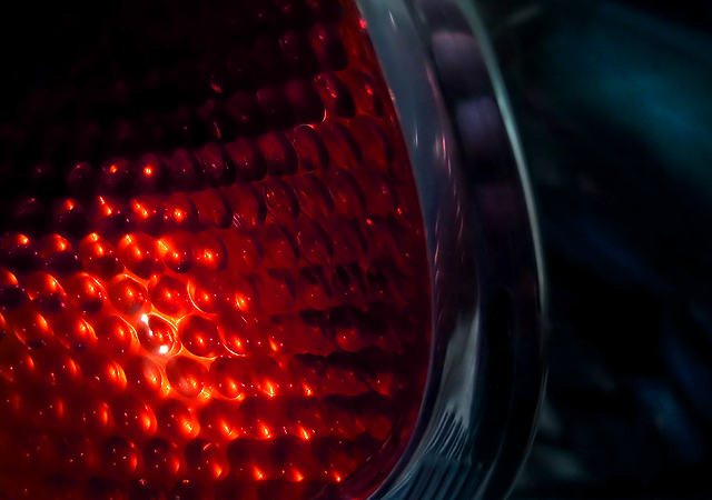
Interesting photo...
Color, saturation and hue are very well done. I really like the red of the lens. It almost looks like some sort of berry.
I think I might have liked this better of the bumper of the car had either been cropped out, or rendered darker possibly even black. As it is, the minor highlights and shapes are a little distracting for me.
Focus and depth of field are excellent.
Alternatively, if your lens would have handled it, a much tighter photo would have worked well also. The one bump on the lens that has the highlights looks almost as if it is bursting or hatching. If this could have been the dominant feature of the photo, it might have been quite interesting as well. |
|
 Photographer found comment helpful. Photographer found comment helpful. |
|
|
10/06/2006 05:14:39 PM |
| Looks like a macro of an insect's eye.....it's no worse than many of those placing above you. Some shots just don't appeal to the masses. |
|
| Photographer found comment helpful. |
|
|
10/06/2006 04:33:08 PM |
Technicals: focus and sharpness are good. The lighting is nicely done. No blowouts and there is enough detail in the darks.
The feel: as an abstract, it probably has about the right score, middle of the road. I like the pattern of the blinker portion. Repeated geometries are a good idea in abstracts (although I am hardly an expert). You try to provide some context with the right half and I'm not sure if this helps or not. As a true abstract, it doesn't. As a "DPC" abstract, it may. DPC is not really an abstract kind of place.
The game: as mentioned, it's really a crapshoot to know what flies here for abstract. The winners are rarely truly abstract (in that you don't know what it is), but they also have strong themes of colors and patterns. The two halves of your shot may have ultimately hurt you in the end. There isn't a good synergy between them. |
|
| Photographer found comment helpful. |
Comments Made During the Challenge  |
|
|
09/30/2006 11:48:52 PM |
| Great capture of the light! I like the colors and the darkness and lightness and stuff. Yay for a comment! |
|
| Photographer found comment helpful. |
Home -
Challenges -
Community -
League -
Photos -
Cameras -
Lenses -
Learn -
Help -
Terms of Use -
Privacy -
Top ^
DPChallenge, and website content and design, Copyright © 2001-2025 Challenging Technologies, LLC.
All digital photo copyrights belong to the photographers and may not be used without permission.
Current Server Time: 03/12/2025 10:37:00 AM EDT.