| Author | Thread |
|
|
10/08/2006 08:30:54 PM |
Critique Club Review:
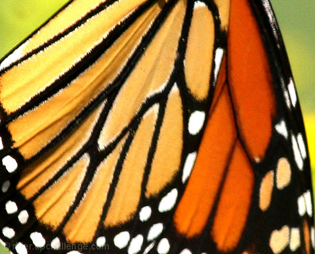
Focus is soft, depth of field does isolate the subject from the background. I don't think depth of field is a problem here, as the subject appears equally soft across the image.
Color, saturation, and hue are good. Brightness and contrast are good as well.
The background appears a bit grainy. Likely due to the ISO 400 used. A lower ISO would have helped with this, and it looks like you hade enough speed avaiable to stop any motion blur.
The other thing I would suggest is rotating the picture 180 degrees. In this view the wings hang down. The energy seems drained. The other way the wings would point up, and appear to have more energy. (It's fun to have a flat panel display that I can rotate.)
I do like the colors and shapes, the biggest point as mentioned by others is the focus. It really needs to be sharper. |
|
 Photographer found comment helpful. Photographer found comment helpful. |
Comments Made During the Challenge  |
|
|
10/01/2006 09:06:40 PM |
| Lovely but it cries out for a sharper focus. |
|
| Photographer found comment helpful. |
|
|
09/30/2006 05:57:38 AM |
| Nice colors but too blurry. |
|
| Photographer found comment helpful. |
|
|
09/27/2006 01:48:12 AM |
| seems just a bit blurry nice color though |
|
| Photographer found comment helpful. |
|
|
09/26/2006 07:29:01 PM |
|
| Photographer found comment helpful. |
|
|
09/26/2006 10:04:46 AM |
| These colors are great. More focus and tighter crop would of worked a bit better. |
|
| Photographer found comment helpful. |
|
|
09/25/2006 11:46:04 PM |
| been done many times but I think still works if sharply focused.............this doesn't cut it |
|
| Photographer found comment helpful. |
|
|
09/25/2006 08:41:23 PM |
| Fuzzy and not in focus. Would be much better if it were in focus. |
|
| Photographer found comment helpful. |
|
|
09/25/2006 06:34:58 PM |
| It could be sharper...is the grainy affect something that was added in post-processing? I'm not sure it works great for this. I like the overall color and pattern but I think it would be more affective if it had been cropped to eliminate the areas of green in the background. |
|
| Photographer found comment helpful. |
|
|
09/25/2006 12:45:11 PM |
My eye keeps trying to sharpen the focus on this.
Good shot! |
|
| Photographer found comment helpful. |
|
|
09/25/2006 12:34:01 PM |
| i tried a shot like this before i went with a different subject. it's a tough shot to execute isn't it? good job! |
|
| Photographer found comment helpful. |
|
|
09/25/2006 05:50:22 AM |
|
| Photographer found comment helpful. |
|
|
09/25/2006 12:36:30 AM |
| Not particulary in focus.. |
|
| Photographer found comment helpful. |
Home -
Challenges -
Community -
League -
Photos -
Cameras -
Lenses -
Learn -
Help -
Terms of Use -
Privacy -
Top ^
DPChallenge, and website content and design, Copyright © 2001-2025 Challenging Technologies, LLC.
All digital photo copyrights belong to the photographers and may not be used without permission.
Current Server Time: 03/12/2025 03:26:04 PM EDT.