| Author | Thread |
|
|
10/22/2003 06:32:19 AM |
| I thaught it was great... hang in there.. tim |
|
Comments Made During the Challenge  |
|
|
10/07/2003 07:14:13 PM |
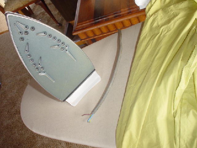
The background is too busy. Also, the iron idea seems to be a popular one this time.
Nice try, though. |
|
|
|
10/03/2003 12:41:23 PM |
|
|
|
10/01/2003 10:48:25 PM |
| The angle is awkward. There are lumps all over. Did you try to increase the size of the file? Good idea though. |
|
|
|
10/01/2003 04:29:15 PM |
base 1: 1/1
challenge: 0/3
technical: 0/3
aesthetics: 0/3
total: 1 |
|
|
|
10/01/2003 02:03:30 PM |
| I like the angle, but there is too many distracting things taking my attention away from the subject. It also looks like it could use some more resolution. |
|
|
|
10/01/2003 09:42:56 AM |
| The sides of the iron have a serrated look to them, probably due to the saving for the web function. Also I think that the background is too busy. It might have been better not too have included the furniture. |
|
|
|
10/01/2003 08:06:20 AM |
| good concept :) Quality could improve - I notice jaggies on the edges of objects here |
|
Home -
Challenges -
Community -
League -
Photos -
Cameras -
Lenses -
Learn -
Help -
Terms of Use -
Privacy -
Top ^
DPChallenge, and website content and design, Copyright © 2001-2025 Challenging Technologies, LLC.
All digital photo copyrights belong to the photographers and may not be used without permission.
Current Server Time: 03/12/2025 02:09:19 AM EDT.