| Author | Thread |
|
|
10/05/2006 05:32:27 PM |
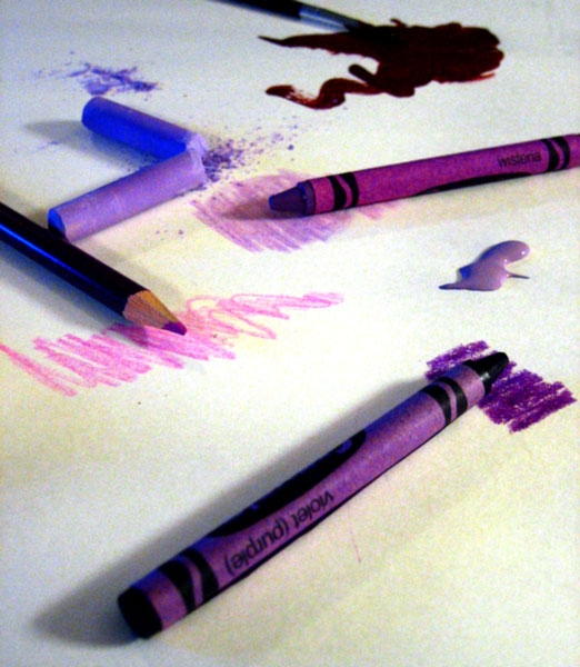
| This is a good idea and I really like the different shades of purple. What probably kept it from scoring higher is the noise and shadows. It appears as if you have a blue light on the left, although it may just appear that way due to PP. The paint on the top of the picture looks more like a very deep red than purple. If you want to use existing light, you may need more of it to reduce noise. |
|
 Photographer found comment helpful. Photographer found comment helpful. |
Comments Made During the Challenge  |
|
|
10/02/2006 07:28:29 AM |
| Great idea - I would have worried that people might think my purple wasn't purple - this fixes that :}!!! |
|
| Photographer found comment helpful. |
|
|
10/02/2006 04:50:41 AM |
| Beautiful idea but i think technically could be better done. |
|
| Photographer found comment helpful. |
|
|
10/01/2006 01:43:44 AM |
| Creative idea. Execution good: nice arrangement of mediums. However, the post-processing is too much, I don't know what term describes the blotchy background. |
|
| Photographer found comment helpful. |
|
|
09/30/2006 06:22:36 PM |
|
| Photographer found comment helpful. |
|
|
09/29/2006 04:54:07 PM |
| I like the idea here, unfortunately it's let down by the technicalities. There seems to be a lot of noise, either camera noise or from increased contrast (I reckon that this image actually works quite well if you dial the contrast down a bit, as then - to me at least - the text on the crayon stands out more). |
|
| Photographer found comment helpful. |
|
|
09/29/2006 10:40:30 AM |
| White balance is off here, and the focus is too soft. |
|
| Photographer found comment helpful. |
|
|
09/29/2006 08:57:50 AM |
| I don't like the shadows. |
|
| Photographer found comment helpful. |
|
|
09/29/2006 07:24:01 AM |
|
| Photographer found comment helpful. |
|
|
09/29/2006 05:15:44 AM |
| It's a shame the high noise in the picture. You should try to add more light to reduce it, or a lower iso. 5 p |
|
| Photographer found comment helpful. |
|
|
09/28/2006 09:54:20 PM |
| it'sa little dark and shadowy |
|
| Photographer found comment helpful. |
|
|
09/28/2006 04:06:50 PM |
| Seems a bit noisy? Love the idea though! 8o) |
|
| Photographer found comment helpful. |
|
|
09/28/2006 10:38:49 AM |
| seems a bit blurry to me, but i like the idea. |
|
| Photographer found comment helpful. |
|
|
09/27/2006 07:51:32 PM |
| the placement of the subject/s is very good. the eyes follow the zigzag movement as suggested by the picture. |
|
| Photographer found comment helpful. |
|
|
09/27/2006 08:51:54 AM |
| This is a very clever solution to the purple challenge. Also well executed |
|
| Photographer found comment helpful. |
Home -
Challenges -
Community -
League -
Photos -
Cameras -
Lenses -
Learn -
Help -
Terms of Use -
Privacy -
Top ^
DPChallenge, and website content and design, Copyright © 2001-2025 Challenging Technologies, LLC.
All digital photo copyrights belong to the photographers and may not be used without permission.
Current Server Time: 03/12/2025 09:33:46 PM EDT.