| Author | Thread |
Comments Made During the Challenge  |
|
|
10/10/2006 10:23:18 PM |
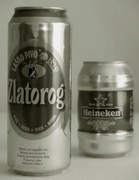
| Very nice. I like the dof. It is enough to not distract from the Zlatorog but not so much that you can't tell that can in the back is a Heineken. The reflections are a bit distracting but overall nice job! |
|
|
|
10/10/2006 10:39:17 AM |
|
|
|
10/10/2006 04:29:56 AM |
| A heine packs a good punch for it's little stubby size! ;) |
|
|
|
10/10/2006 02:18:31 AM |
| b&w.. didn't appeal that much |
|
|
|
10/08/2006 03:54:29 PM |
size isn't everything.
na zdravi |
|
|
|
10/06/2006 10:12:01 PM |
| I like the duatone. The text could be a bright bold color and font to really grab the viewers attention. Comp works really well for the creative placement of test and the product is very well displayed. |
|
|
|
10/05/2006 09:47:12 PM |
| I don't know who is bigger because you gave almost equal importance to both with your contrast and aperture. One should have been more out of focus than the other if you wanted to make one "bigger" |
|
|
|
10/05/2006 09:01:39 PM |
| 6: Interesting effect on the Heineken can but the B&W effect seems to dull the interest in the shot |
|
|
|
10/04/2006 12:39:00 PM |
|
Home -
Challenges -
Community -
League -
Photos -
Cameras -
Lenses -
Learn -
Help -
Terms of Use -
Privacy -
Top ^
DPChallenge, and website content and design, Copyright © 2001-2025 Challenging Technologies, LLC.
All digital photo copyrights belong to the photographers and may not be used without permission.
Current Server Time: 03/12/2025 06:32:18 PM EDT.