| Author | Thread |
Comments Made During the Challenge  |
|
|
10/10/2006 10:51:24 PM |
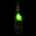
| The colors seem a little flat. I really like the setup though! |
|
|
|
10/10/2006 08:29:42 PM |
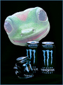
| Like the color and idea. Good comp but I would have cropped just a little tigher on the left. |
|
|
|
10/05/2006 06:44:22 PM |
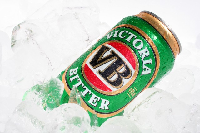
| 7: Nice shot that would be well suited for a VB add. |
|
|
|
10/05/2006 04:32:44 PM |
| I'm guessing this might look a lot better on a darker screen than mine... it does seem that there's just a bit of detail in the bright whites, but I think it would look a lot better if there was more range there. |
|
|
|
10/05/2006 03:00:32 PM |
|
|
|
10/05/2006 10:12:03 AM |
| Nice attention to detail. I always like condensation on cold beverage ads. White balance adjustment could've helped bring out a little more detail on the ice. Comp works well for text placement. |
|
|
|
10/04/2006 11:23:46 PM |
| I love the idea, but it is hard to see the ice. |
|
|
|
10/04/2006 08:36:40 PM |
| Like the ice. Wish it stood out more though. |
|
|
|
10/04/2006 09:40:45 AM |
| Good color, maybe a bit more dof. Ice is not easy to shoot. |
|
|
|
10/04/2006 05:40:51 AM |
|
|
|
10/04/2006 12:44:20 AM |
| somebody had a good grand final day! |
|
Home -
Challenges -
Community -
League -
Photos -
Cameras -
Lenses -
Learn -
Help -
Terms of Use -
Privacy -
Top ^
DPChallenge, and website content and design, Copyright © 2001-2025 Challenging Technologies, LLC.
All digital photo copyrights belong to the photographers and may not be used without permission.
Current Server Time: 04/28/2025 03:13:47 AM EDT.