| Author | Thread |
Comments Made During the Challenge  |
|
|
08/11/2002 02:02:00 PM |
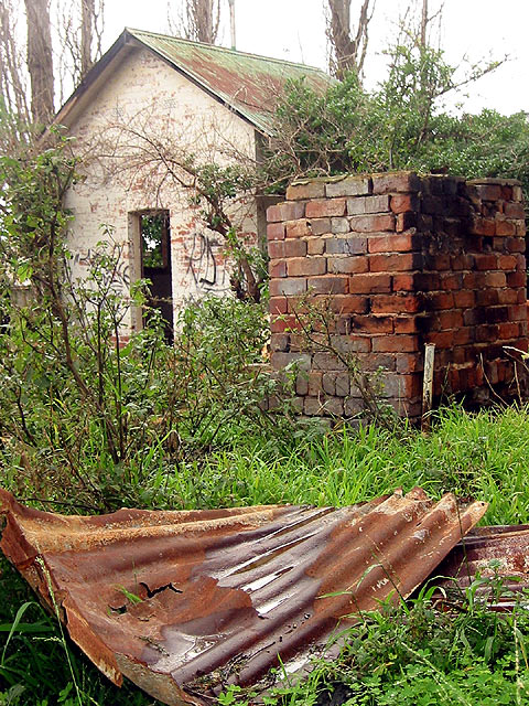
| this is a wonderful subject. I like the color contrast between the warm rust and bricks and the cool grass. you might want to try to tone down the sky. if you made the whole image a little darker, it might enhance the abandoned feeling of the building and keep the sky from bleeding like that. nice shot. |
|
|
|
08/10/2002 07:24:00 PM |
Something old. Use your photographic technique to emphasize the age of your subject.
Composition - good. I'd like to see it without the metal roof in foreground
Technical Aspects - quite good
Meets Challenge - probably. Might look unkempt, not old.
Visual Impact / Originality - good
|
|
|
|
08/10/2002 03:38:00 PM |
| Foreground (corrigated tin) image detracts from building. =5 in my humble opinion - syamjonimi |
|
|
|
08/10/2002 12:45:00 AM |
| nice title :) I like the "DOF" - as it is commonly refered to on this site... |
|
|
|
08/09/2002 02:43:00 PM |
| Wonderful subject. Slightly overexposed. I would crank the EV down 2/3 to 1 stop |
|
|
|
08/09/2002 08:00:00 AM |
| Nice use of the old roofing to get something into the foreground. |
|
|
|
08/06/2002 06:14:00 PM |
| very nice example of 'rustic' :) I think the top portion of this image is slightly over exposed.. .maybe a neutral density or polarizing filter would remedy this one. Good shot :) - jmsetzler |
|
|
|
08/06/2002 03:41:00 PM |
| great composure and exposure. basicaly perfect. |
|
|
|
08/06/2002 10:51:00 AM |
| Good job of conveying the subject. I like the contrasting colors of bright greens and brown/red rust. The amount of new growth over and around the structure and the metal help define your subject. Great framing too. |
|
|
|
08/06/2002 10:38:00 AM |
| Very nice composition of the picture. The corrugated metal in the front is a real eye-catcher and the vanishing of the colours towards the back are great! Congratulations |
|
|
|
08/06/2002 09:07:00 AM |
| What is derelict? The building? The wall? The corrugated iron sheet? Nice focus, colour and contrast but the picture lacks direction. Where are we supposed to be looking? |
|
|
|
08/06/2002 07:18:00 AM |
|
|
|
08/06/2002 12:54:00 AM |
very moody and soft. lovely color and textures. couldn't change a thing. ~mcmurma
Aesthetics...8
Meets Challenge...8
Overall... |
|
|
|
08/05/2002 08:53:00 PM |
| I'd have been tempted to focus on the rusty iron in front and leave the house out. |
|
|
|
08/05/2002 12:22:00 PM |
| The sky washes out the top of the building and tree bark.Otherwise really nice composition,you were standing in exactly the right place. |
|
|
|
08/05/2002 10:52:00 AM |
| I like this photo very much, especially the foreground interest leading the eye back into the bakground. Very well done. |
|
|
|
08/05/2002 05:59:00 AM |
| I love the composition and the colours in this photo. Very well done. |
|
|
|
08/05/2002 04:53:00 AM |
| The low saturation in the rooftop's colors and the white space above takes away from what could have been a stronger composition. I think a bit of saturation would have definitely helped. |
|
Home -
Challenges -
Community -
League -
Photos -
Cameras -
Lenses -
Learn -
Help -
Terms of Use -
Privacy -
Top ^
DPChallenge, and website content and design, Copyright © 2001-2025 Challenging Technologies, LLC.
All digital photo copyrights belong to the photographers and may not be used without permission.
Current Server Time: 03/12/2025 01:29:23 AM EDT.