| Author | Thread |
Comments Made During the Challenge  |
|
|
10/10/2006 11:09:55 AM |
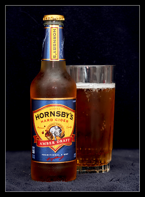
| Standard, space-efficient bar card composition. The brew needs back or sub light to make it pop from dark bacground. Try gold foil strip strategically placed behind glass and bottle or cut hole in base material (towell?) and fire light up from underneath. Add salt to increase/maintain head during shoot. Good start. |
|
 Photographer found comment helpful. Photographer found comment helpful. |
|
|
10/10/2006 02:16:14 AM |
| perhaps this would have looked better on a flat black surface |
|
| Photographer found comment helpful. |
|
|
10/10/2006 12:12:52 AM |
| A hard base would have suited the image more IMP. The velvet table cover looks very soft |
|
| Photographer found comment helpful. |
|
|
10/09/2006 09:55:40 PM |
| Great picture, focus, and light, but the towel or carpet or whatever is distracting. |
|
| Photographer found comment helpful. |
|
|
10/09/2006 05:08:40 AM |
|
| Photographer found comment helpful. |
|
|
10/07/2006 09:19:48 PM |
| Sweet! I'll pick some up. 10. |
|
| Photographer found comment helpful. |
|
|
10/05/2006 09:38:56 PM |
| the towel was a bad choice... Anyway it's a good shot. |
|
| Photographer found comment helpful. |
|
|
10/05/2006 06:49:50 PM |
| 6: A nice simple shot that would be well suited to an add. The lighting is a little bit harsh. I'll add an extra point (7) to compensate for those that may vote low as this isnt beer or soft drink. |
|
| Photographer found comment helpful. |
|
|
10/05/2006 06:04:39 PM |
| Not bad. Focus should have been on the big label though. It's blurred enough to be a distraction when it should be the highlight of the image. Reflections on the top of the glass should go (black sheet behind you?) Good job. |
|
| Photographer found comment helpful. |
|
|
10/05/2006 01:34:28 AM |
| Not feeling the "traditional" part. Perhaps a different backdrop or surface could have brought that out? |
|
|
|
10/04/2006 11:22:18 PM |
| The border goes wll with the picture, and like the setup. |
|
| Photographer found comment helpful. |
|
|
10/04/2006 08:11:26 PM |
| Nice presentaton of product. Dust in carpet and reflection in glass are two avoidable distractions (fill glass more and dust off carpet). Nice comp lends itself well to text placement. Nice job aside from small fixable details. |
|
| Photographer found comment helpful. |
|
|
10/04/2006 09:49:52 AM |
| Nice light control and good color. |
|
| Photographer found comment helpful. |
|
|
10/04/2006 05:08:35 AM |
| I really like the colour and the comp...I like the frost on theglass and bottle, but I don't care too much for what you have used as a base (towel?) this makes the image look cheap and ametuerish...perhaps some black card would have been better |
|
| Photographer found comment helpful. |
|
|
10/04/2006 12:57:27 AM |
| Neither a beer nor a soft drink. |
|
Home -
Challenges -
Community -
League -
Photos -
Cameras -
Lenses -
Learn -
Help -
Terms of Use -
Privacy -
Top ^
DPChallenge, and website content and design, Copyright © 2001-2025 Challenging Technologies, LLC.
All digital photo copyrights belong to the photographers and may not be used without permission.
Current Server Time: 03/12/2025 07:42:09 AM EDT.