| Author | Thread |
Comments Made During the Challenge  |
|
|
10/14/2006 06:06:04 PM |
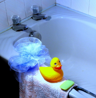
| why so small? Bigger would surely have been better here. |
|
 Photographer found comment helpful. Photographer found comment helpful. |
|
|
10/12/2006 01:04:43 PM |
| There seems to be a blue cast over the tub. I would like it better if the tub was white. |
|
| Photographer found comment helpful. |
|
|
10/11/2006 11:28:48 PM |
| I like this image a lot. The angle is fun, composition is pretty good. Might be better if the left side was cropped in more putting duck in 1/3 from the right edge. I like the color- the cool tones work well in contrast to the yellow duck. Would like to see this image larger (using the full 640px). Also would have cloned out the blemish in the tub near the lower right area. 7 |
|
| Photographer found comment helpful. |
|
|
10/11/2006 06:22:11 PM |
| the entire scene is a bit blue. I think you haven't chosen the right white balance for the scene. |
|
| Photographer found comment helpful. |
|
|
10/11/2006 03:56:39 PM |
| The image is a bit on the small size. Photographically the lighting seems a bit over-harsh on the duck. |
|
| Photographer found comment helpful. |
|
|
10/11/2006 03:25:06 PM |
Here's a great tutorial on sizing your images:
//www.dpchallenge.com/tutorial.php?TUTORIAL_ID=26
Lighting seems a little harsh/off. |
|
| Photographer found comment helpful. |
|
|
10/11/2006 11:46:04 AM |
| Size rather small. I think this would have been better if cropped in on the duck and soap more. |
|
| Photographer found comment helpful. |
|
|
10/11/2006 12:41:16 AM |
| Too much background. I find it distracting. |
|
| Photographer found comment helpful. |
Home -
Challenges -
Community -
League -
Photos -
Cameras -
Lenses -
Learn -
Help -
Terms of Use -
Privacy -
Top ^
DPChallenge, and website content and design, Copyright © 2001-2025 Challenging Technologies, LLC.
All digital photo copyrights belong to the photographers and may not be used without permission.
Current Server Time: 03/12/2025 02:44:42 PM EDT.