| Author | Thread |
|
|
10/20/2006 06:08:30 PM |
Critique Club Review:
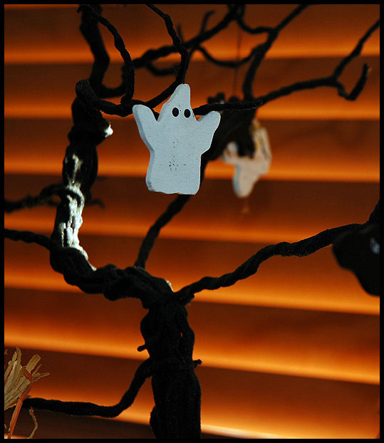
Technical: focus and depth of field are good. Nice use of a shallow depth of field to reduce background distractions. Color, saturation and hue are OK. Lighting is a bit off, the bright highlight on the tree steals the show from the ghost somewhat.
Reaction: The straw at lower left distracts some, along witht the very bright highlight on the tree. The image would have worked better had the ghost been highlighted. The ghost is a bit centered, but not a fatal problem. Some people might have voted you down a bit, seeing eyes as part of a face. I like the backround colors and pattern. I think the big problem is I like it too much. The background is great, but it makes the ghost look a little weak in comparison. It's just more or less a ghost hanging in a tree in front of a cool background. If the ghost were better lit, and perhaps a bit larger in the frame, it might work better.
|
|
 Photographer found comment helpful. Photographer found comment helpful. |
Comments Made During the Challenge  |
|
|
10/11/2006 12:15:34 PM |
| Very good color to match the Halloween theme - nice light on the branch. I think maybe if the ghost weren't quite so clost to center it would be a bit more effective. Still, an interesting entry! |
|
| Photographer found comment helpful. |
|
|
10/09/2006 10:17:28 AM |
|
Home -
Challenges -
Community -
League -
Photos -
Cameras -
Lenses -
Learn -
Help -
Terms of Use -
Privacy -
Top ^
DPChallenge, and website content and design, Copyright © 2001-2025 Challenging Technologies, LLC.
All digital photo copyrights belong to the photographers and may not be used without permission.
Current Server Time: 03/13/2025 01:43:15 AM EDT.