| Author | Thread |
Comments Made During the Challenge  |
|
|
10/12/2006 09:26:35 AM |
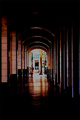
| Don't short-change yourself with the title! It causes voters devalue your work. This is a nice photo, might benefit from a little more dynamic lighting and sharper focus, but the composition and idea are nice! 8o) |
|
|
|
10/11/2006 11:20:50 PM |
|
|
|
10/09/2006 03:00:40 PM |
Fit Challenge Criteria: 1/2 - The title says it all
Contrast/Color: 1/2 - The lighting seems really flat. Maybe a levels or curves adjustment could've helped out
Composition: 1/2 - I don't notice anything technically wrong with it, but it just doesn't help the photo "pop" out to me, the viewer
Photo Quality: 1/2 - The range of tones could have been expanded more to give the overall photo better highlights. The crop is a bit close also.
My Subjective Affinity: 0/2 |
|
|
|
10/09/2006 10:14:43 AM |
| but ... but ... i can see the face :-) |
|
|
|
10/09/2006 03:25:37 AM |
| eye see you...sorry I had to do it. |
|
Home -
Challenges -
Community -
League -
Photos -
Cameras -
Lenses -
Learn -
Help -
Terms of Use -
Privacy -
Top ^
DPChallenge, and website content and design, Copyright © 2001-2025 Challenging Technologies, LLC.
All digital photo copyrights belong to the photographers and may not be used without permission.
Current Server Time: 03/12/2025 09:41:41 AM EDT.