| Author | Thread |
|
|
10/23/2006 02:05:53 AM |
*Critique Club*
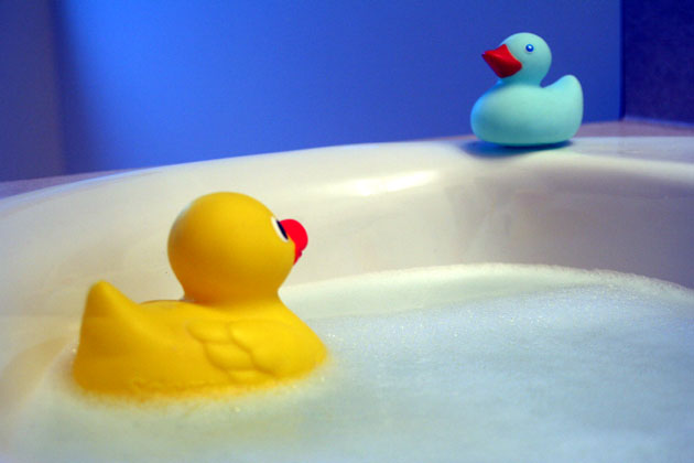
Great setup! I think you did a great job at what you planned to do. I love the composition and colors.. I agree with the previous comment: this shot is "nice to view" :-) My favorite part is how you can see the reflection of the yellow duck right under the blue one... it just seems like a nice touch.
I think one thing that really hurt you was the pixelatedness. The maximum allowed file size is 150K and taking advantage of that will give you pictures that look much smoother. The left and right sections of blue especially would look better at a higher file size. I think it would also take care of some of the "softness" although I am not sure. I don't know if you intended the focus to be the way it was but I do like how the blue duck is a bit soft. The softness on the yellow duck doesn't help or hurt, for me, but I can definitely see how others would want it more in focus because it looks like the main point of interest visually.
All in all I think this is a good shot, and congrats on being able to implement your concept! |
|
 Photographer found comment helpful. Photographer found comment helpful. |
Comments Made During the Challenge  |
|
|
10/14/2006 05:58:38 PM |
| The blue background and blurriness are destracting. |
|
|
|
10/13/2006 04:10:20 PM |
| I like the composition of this photo, with a ducky in both the foreground and the background. But it seems as though the focus is a little soft on both of them. I like the color choice of the background, though it tends to show noise a little more than lighter colors. |
|
| Photographer found comment helpful. |
|
|
10/13/2006 11:23:03 AM |
| I like it that the reluctant ducky is blue. Very nice. ~9 |
|
|
|
10/12/2006 09:53:14 AM |
| Nice blue light, but I feel the shot lacks some overall sharpness to make it stand out. |
|
| Photographer found comment helpful. |
|
|
10/11/2006 04:54:36 PM |
| Simplistic and nice to view. |
|
|
|
10/11/2006 03:38:35 PM |
| i love the colors and the subtle bubbles holding "duckie"...wish i could join! |
|
|
|
10/11/2006 01:24:19 PM |
| Looks a little grainy, and needs more DOF. IMO the shot could have been done from a slightly different angle to allow the use of the tub/sink line for a horizontal straitening, instead of the back walls, this would also eliminate some of the shadows on the walls and allow for a better crop. JMO.. |
|
| Photographer found comment helpful. |
|
|
10/11/2006 08:53:47 AM |
| The Blue ducky should have been saying the water's fine. Just like a little kid who has blue lips but refuses to come in from the water. |
|
Home -
Challenges -
Community -
League -
Photos -
Cameras -
Lenses -
Learn -
Help -
Terms of Use -
Privacy -
Top ^
DPChallenge, and website content and design, Copyright © 2001-2025 Challenging Technologies, LLC.
All digital photo copyrights belong to the photographers and may not be used without permission.
Current Server Time: 03/12/2025 03:25:04 AM EDT.