Greetings from the Critique Club :
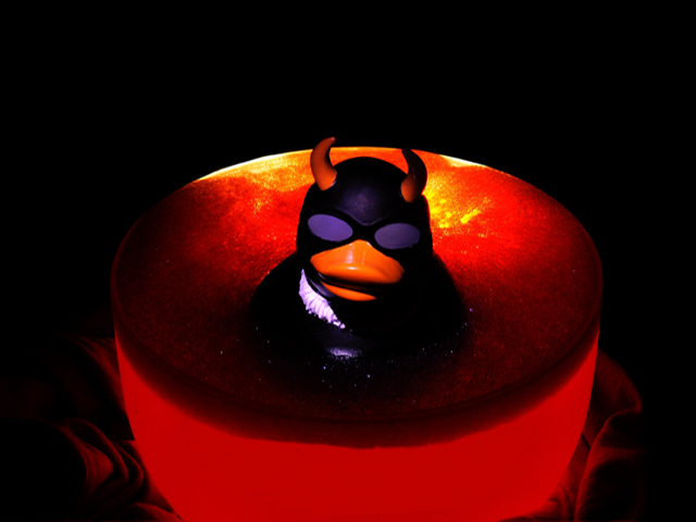
FIRST IMPRESSION: I love the bright colors, especially the red, glowing bathtub. And I find the evil ducky to be very funny.
COMPOSITION: The composition captures my attention and conveys the message quickly. I find that it fails to keep my interest once I get the joke. The wide black margin is effective in drawing our eye to the red bathtub, but there is a way in which the subject is plopped in the middle of the photo, that creates a bit of a static feel to the photo. The glowing orange light around the head works well to delineate ducky from his background very effectively, which is great. The head-on lighting, though, augments the static feel of the photo.
LIGHTING: Mostly, I find the lighting effective. There are lots pf places where the glowing qualities really make the photo shine. There is, however, a white strip around ducky's neck that appears to be a reflection and I find it distracting.
PHOTOGRAPHIC TECHNIQUE: The photo is crisp and clear, free of obvious flaws. I can't help but wonder whether the treatment might have been improved with a longer lens and a shorter DOF. This would further help the eye distinguish ducky from bath. I also wonder whether a lower camera angle might have helped to make ducky a little more menacing. Any ducky who looks like that deserves to be taken seriously!
EDITING: Burning to remove a distracting toilet bowl proved a wise choice. So did hiking up the saturation. Did you consider cloning out the flecks of lilac light in the water in front of ducky?
OVERALL: It is an effective, humorous shot for this competition. |