| Author | Thread |
Comments Made During the Challenge  |
|
|
08/10/2002 04:57:00 PM |
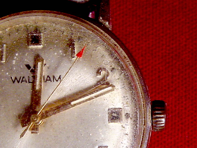
| This is nicely framed and the red background works because of the red tip of the second hand pointing in the direction of the background. I guess the texture of the background works too since the watch is somewhat weathered and not smooth. |
|
|
|
08/10/2002 09:46:00 AM |
|
|
|
08/09/2002 05:58:00 PM |
| I like the composition and how clearly the dirt on the watch face is visible. |
|
|
|
08/09/2002 04:55:00 PM |
Excellent photo. The title gives the photo a hint of mystery - thought provoking. The quality is great. Effective cropping and composition. Excellent work!! 9
Ruthann |
|
|
|
08/09/2002 02:32:00 PM |
| Fair composition for the theme, but the title makes up for much of it. |
|
|
|
08/08/2002 03:31:00 PM |
| Nice variation on the classic watch picture. Good concept and framing. |
|
|
|
08/08/2002 11:06:00 AM |
|
|
|
08/07/2002 04:31:00 PM |
|
|
|
08/07/2002 07:44:00 AM |
| A moving title. It could mean lots of things and leads one to imagine what it does mean. |
|
|
|
08/06/2002 06:49:00 PM |
| I like the way this is composed. Very good macro shot. Boy that thing is dirty, no wonder it gave up on living. I almost did a macro shot of a very old dead watch too. They make very good subjects. |
|
|
|
08/06/2002 03:56:00 PM |
| Looks more like 12:12 to me. |
|
|
|
08/06/2002 02:12:00 PM |
|
|
|
08/06/2002 01:30:00 PM |
| Like the clocks all stop when someone dies? or was the watch worn in a accident. Very nice The watch is great and the red tip on the second hand is striking, I think the texture of the red is distracting however |
|
|
|
08/06/2002 12:07:00 PM |
| Really good. I wanted to do somthing like this. You did a great job. |
|
|
|
08/05/2002 10:22:00 PM |
| Great title -- super shot! Nice DOF, too. |
|
|
|
08/05/2002 09:59:00 PM |
Something old. Use your photographic technique to emphasize the age of your subject.
Composition - quite good
Technical Aspects - quite good
Meets Challenge - I have a problem here. Looks like water stopped it, not age.
Visual Impact / Originality - ok
|
|
|
|
08/05/2002 08:58:00 PM |
| Good idea, however I think a little more indirect light would have made a big difference. In my opinion any way. Autool |
|
|
|
08/05/2002 04:47:00 PM |
| I like the subject and the cropping of this picture. I am grateful that you didn't fall for the B&W clichĂƒÂ© for this challenge. I belive the ticker is at 12:12... |
|
|
|
08/05/2002 03:52:00 PM |
| This is an interesting perspective of an old watch... I think the off centering of the subject works very well here... I believe that the only improvement that I could suggest for this subject would be a smooth textured background. The background that you have is not bad, but a smooth background would possibly enhance the overall impact of the image by removing the 'texture' constrasts from the non-subject area of the photo... - jmsetzler |
|
|
|
08/05/2002 02:15:00 PM |
| Background is distracting. |
|
|
|
08/05/2002 01:38:00 PM |
| Cool image, cool title. Find the two colored backgrounds somewhat distracting. |
|
|
|
08/05/2002 11:28:00 AM |
| I like it. I don't know about the red cloth, though... |
|
|
|
08/05/2002 11:22:00 AM |
| I'm a macro fan, and I think the shot itself is well composed, well lit and technically up to the mark. OK, here it comes Ă¢€“ but Ă¢€“ it looks more dirty than old. I can't fault the picture, but I think it loses a bit in translation of the challenge Ă¢€“ (7) |
|
|
|
08/05/2002 10:40:00 AM |
| exceedingly cool watch nice background and lighting |
|
|
|
08/05/2002 08:40:00 AM |
| Looks more like 12:12 to me... Nice picture. I like the concept. Focus is good. Lighing is good. 7 |
|
Home -
Challenges -
Community -
League -
Photos -
Cameras -
Lenses -
Learn -
Help -
Terms of Use -
Privacy -
Top ^
DPChallenge, and website content and design, Copyright © 2001-2025 Challenging Technologies, LLC.
All digital photo copyrights belong to the photographers and may not be used without permission.
Current Server Time: 03/12/2025 11:25:42 PM EDT.