| Author | Thread |
Comments Made During the Challenge  |
|
|
10/14/2003 02:09:00 PM |
| Good colors, I like the building. |
|
|
|
10/12/2003 10:50:31 AM |
| What an incredible brewery!! |
|
|
|
10/12/2003 01:26:57 AM |
| Beautiful shot! Looks almost like a painting. |
|
|
|
10/10/2003 10:02:36 PM |
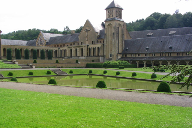
| Nice photo! Greens are brilliant. I wish the whole of the building could be in the picture, but that may not have been possible. I do find the tree branch on the right to be distracting. My suggestion would've been to go for the area around that tower as the focus, that way the road and trees would've probably been out of the photo all together. I'd love to see a view from the end of that pond looking up the stairs. :) 6 |
|
|
|
10/10/2003 03:50:31 AM |
| Great viewpoint. Nice depth and perspective. A bit too close cropped, maybe less grass, more sky balance. |
|
|
|
10/10/2003 12:34:35 AM |
|
|
|
10/09/2003 10:28:36 PM |
| Perfect composition for this building and grounds. The lack of contrast makes the picture look more boring than it needs to be. Too bad you couldn't clone out the tree on the right. |
|
|
|
10/09/2003 04:43:06 AM |
base 1: 1/1; challenge: 2/3; technical: 1/3; aesthetics: 2/3; total: 6
Beautiful church/cathedral/whatever, but this single building doesn't meet 100% of the challenge 'picture of buildings' -- plural. The pond reflection is nice -- I wish it showed more of a reflection -- perhaps a polarizing filter? The pond is clipped off the corner on the left and the part of a tree branch on the right are distracting. Perhaps moving to the right to get MORE of the tree and also the left edge of the pond would have given a better perspective. The sky also looks blown out, but maybe it really was this white that day. |
|
|
|
10/08/2003 11:49:36 PM |
| beautiful colors...great shot. |
|
|
|
10/08/2003 02:38:41 PM |
| You need to do something about the sky, as it's a bit washed out. A closer view probably would have worked well since this is such an interesting building. |
|
|
|
10/08/2003 12:00:07 PM |
| The building contrasts nicesly with the amazingly green grass to create a very attractive picture. |
|
|
|
10/08/2003 10:31:47 AM |
| Crop is a wee bit tight at the top. :( Beautiful building and grounds. |
|
|
|
10/08/2003 07:53:45 AM |
| Great colors - I'd say it would look better if you cropped some of the grass off on the bottom, and added a little more sky |
|
|
|
10/08/2003 06:19:24 AM |
|
|
|
10/08/2003 01:29:52 AM |
| Neat perspective, lovely subject little overexposed (on my screen) and could be a tad sharper, but I like it |
|
Home -
Challenges -
Community -
League -
Photos -
Cameras -
Lenses -
Learn -
Help -
Terms of Use -
Privacy -
Top ^
DPChallenge, and website content and design, Copyright © 2001-2025 Challenging Technologies, LLC.
All digital photo copyrights belong to the photographers and may not be used without permission.
Current Server Time: 03/12/2025 12:38:36 PM EDT.