| Author | Thread |
|
|
10/15/2003 09:14:17 AM |
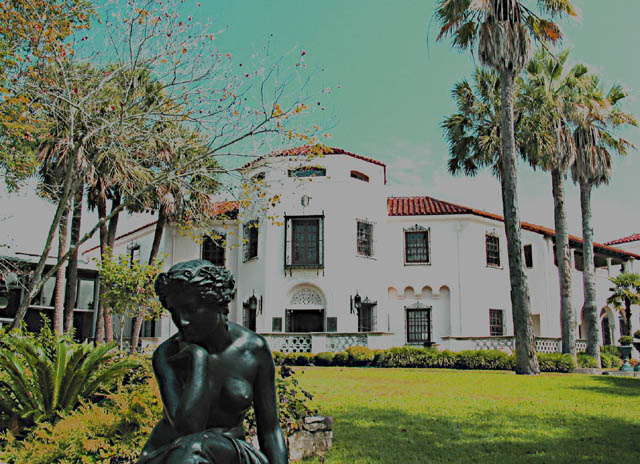
| This in an interesting photo. It looks like a painting. I really don't mind you pushing the levels around, but some people here on DPC hate that. I think your point of view is quirky and unique; I like it a lot. |
|
Comments Made During the Challenge  |
|
|
10/14/2003 11:03:18 PM |
the colours and tones are rather dull.
too high contrast on the building, causing details lost.
position of sculture awkward. |
|
|
|
10/14/2003 01:57:15 PM |
| Colors, look wierd, good building. |
|
|
|
10/13/2003 12:05:59 PM |
A vintage look. I see it now.
Is the focal point the statue or the building? |
|
|
|
10/12/2003 08:29:14 PM |
| Pretty good composition. I like the focus on the woman. You could have even gotten closer to get more detail in her face. I don't know if you adjusted the colors and contrast in a program, but I think they are a bit harsh although that color in your sky was popular during that era. I think I would have stood closer, more to the left (so she's looking at me) with the building taking up most of the frame and focused only on her. Sorry. I got carried away. |
|
 Photographer found comment helpful. Photographer found comment helpful. |
|
|
10/12/2003 06:37:09 PM |
| I like the setup of this picture; the angle, the building itself, the statue. I don't really care for the colors chosen, though. I think this would look beautiful in it's natural colors. |
|
| Photographer found comment helpful. |
|
|
10/10/2003 09:55:10 PM |
| I'm not sure if this had a filter on it, but it definitely has a different tone to it, it works with this photo. Gives it a painting look. I did find the statue distracting however, since its an urban landscape I think the building should be the focus, but I find my eyes drawn to the statue since its so forward in the picture, this lowered my vote a bit. Also looks like it could be a bit sharper. 6 |
|
| Photographer found comment helpful. |
|
|
10/10/2003 09:54:15 AM |
| I really like the concept here, the feeling of urban and landscape come through very well but I'm not sure I like the coloration you did to the shot. It's interesting and certainly grabs your attention at first but then it's almost distrubing, to me anyway. |
|
| Photographer found comment helpful. |
|
|
10/10/2003 04:12:00 AM |
| This looks like a very interesting location, but your photo is overprocessed. The colours look very odd for this photo to be of any merrit. Inclussion of the statue is really not neccessary for this image to work - it distracts from the main subject - the beautiful building. Also I woldn't have chopped the front palm tree off. |
|
|
|
10/10/2003 01:11:48 AM |
| really cool effect, i like it. |
|
| Photographer found comment helpful. |
|
|
10/09/2003 07:04:51 PM |
| nice effect, if only a little lighter |
|
| Photographer found comment helpful. |
|
|
10/09/2003 06:33:21 PM |
| The colour shift your PP has given this a surreal quality which though interesting is not to my taste. |
|
| Photographer found comment helpful. |
|
|
10/09/2003 05:29:48 PM |
| Hmmm.. This would be a really nice shot but it looks like there's too much level adjustment in the post editing. (Or you used too much of a filter on the camera) Was origional shot too bright? Well, good luck. |
|
| Photographer found comment helpful. |
|
|
10/08/2003 07:48:07 PM |
| contrast is bad in this picture. Doesn't really feel "urban" . |
|
|
|
10/08/2003 06:40:12 PM |
| Interesting effect you've created here, I am not sure if it is fitting or not.... the perspective is good! |
|
| Photographer found comment helpful. |
|
|
10/08/2003 03:43:31 PM |
| Oh - a la 1950! Now I get why you're using that effect - you certainly nailed it. I'm not sure about the composition, though. Maybe lower the shot and shift it right - more of the statue and move the statue more to the left. |
|
| Photographer found comment helpful. |
|
|
10/08/2003 01:33:53 PM |
| Nice retro look to the photo. (Good thing you mentioned it in the title) |
|
| Photographer found comment helpful. |
|
|
10/08/2003 12:50:54 PM |
not sure i like the effects used on this
the sky is green?
composition is good.
5
soup |
|
| Photographer found comment helpful. |
|
|
10/08/2003 11:44:56 AM |
| wonderful retro color, hope it doesn't go unappreciated |
|
| Photographer found comment helpful. |
|
|
10/08/2003 08:49:45 AM |
| Something has gone badly wrong with your colours. 2 |
|
Home -
Challenges -
Community -
League -
Photos -
Cameras -
Lenses -
Learn -
Help -
Terms of Use -
Privacy -
Top ^
DPChallenge, and website content and design, Copyright © 2001-2025 Challenging Technologies, LLC.
All digital photo copyrights belong to the photographers and may not be used without permission.
Current Server Time: 03/13/2025 04:26:12 AM EDT.