| Author | Thread |
|
|
01/16/2007 08:12:29 PM |
| Very nice, love the simplicity. |
|
 Photographer found comment helpful. Photographer found comment helpful. |
|
|
10/27/2006 06:31:07 AM |
Hello from the Critique Club,
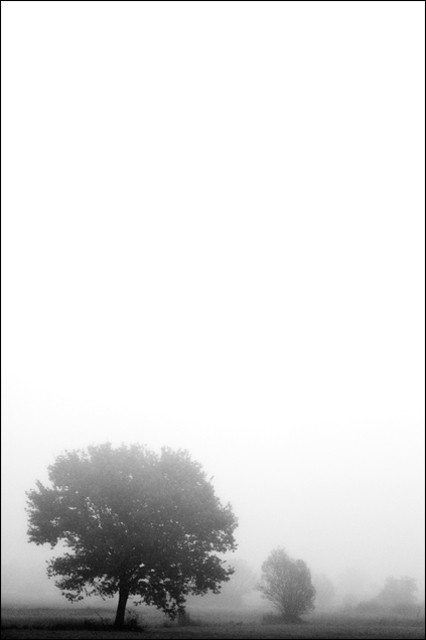
First, let me thank you for including so many details in your photographer's comments. Now for the critique. My first impression is that this definitely looks like morning fog and has an interesting subject. With nearly one third of your votes being a 5 and over half the votes in the 5 to 6 range, to me that indicates that the voters looked for literally 2-3 seconds and concluded, "this picture isn't bad, so I can't give 4 or less, but it doesn't have a lot of wow, so I can't give it a 7 or higher". For some reason, black and white images didn't score very well in this challenge. I also see by the comments left during voting that the large amount of negative space above the trees was a love it or hate type thing. It would have been safer to crop tighter on the trees, maybe in a landscape format, but the image might have lost some of its impact. Personally I like the portrait format and wouldn't change a thing. You have a very good image that anyone at DPC would be proud to have in their portfolio.
Feel free to PM me if you have any questions regarding this critique.
Tim
|
|
| Photographer found comment helpful. |
Comments Made During the Challenge  |
|
|
10/22/2006 11:52:04 PM |
| only thing i can add is that there may be just a tad too much open space on the top, maybe taken landscape.... |
|
| Photographer found comment helpful. |
|
|
10/22/2006 08:22:57 AM |
Great use of dead space.
On of the best in his challenge.
Good luck
Kev |
|
| Photographer found comment helpful. |
|
|
10/22/2006 02:35:40 AM |
| don't care for the comp... needs a crop off the top 6 |
|
| Photographer found comment helpful. |
|
|
10/19/2006 11:49:57 PM |
| Nice and simple. I like fog shots. |
|
| Photographer found comment helpful. |
|
|
10/19/2006 12:15:52 PM |
| The portrait orientation with all the empty space just doesn't do it for me. I would have prefered a landscape. Otherwise a good shot. |
|
| Photographer found comment helpful. |
|
|
10/18/2006 10:26:10 PM |
| I love the negative space at the top. Really nice! |
|
| Photographer found comment helpful. |
|
|
10/17/2006 09:03:12 PM |
| I like the cool use of negative space. |
|
| Photographer found comment helpful. |
|
|
10/17/2006 03:03:17 PM |
| Too much negative space. if the contrast was a bit more stark rather than graduated from the fog, then the extra negative space may have been more effective. With those elements I would have cropped down just a bit and it would have been more effective. |
|
| Photographer found comment helpful. |
|
|
10/17/2006 11:54:44 AM |
| nice use of negative space |
|
| Photographer found comment helpful. |
|
|
10/17/2006 10:35:39 AM |
Meets Challenge - 2
Lighting/Processing - 2
Composition - 2
Overall Impression - 2
"WOW" factor - 0
Score: 8 |
|
| Photographer found comment helpful. |
|
|
10/17/2006 10:20:28 AM |
| Ooooooh. . .I love photos like this! I love the fog, and I love the minimalist approach to this type of scene. Fantastic photo! I really hope its doing well! |
|
| Photographer found comment helpful. |
|
|
10/16/2006 01:00:45 PM |
| One of my favourites of this challenge. Exceptionally simple yet very rich in implied location and tone. 9. |
|
| Photographer found comment helpful. |
|
|
10/16/2006 03:05:28 AM |
| 8: Nice composition and good use of empty space |
|
| Photographer found comment helpful. |
Home -
Challenges -
Community -
League -
Photos -
Cameras -
Lenses -
Learn -
Help -
Terms of Use -
Privacy -
Top ^
DPChallenge, and website content and design, Copyright © 2001-2025 Challenging Technologies, LLC.
All digital photo copyrights belong to the photographers and may not be used without permission.
Current Server Time: 03/11/2025 02:11:23 PM EDT.