| Author | Thread |
Comments Made During the Challenge  |
|
|
08/09/2002 07:12:00 PM |
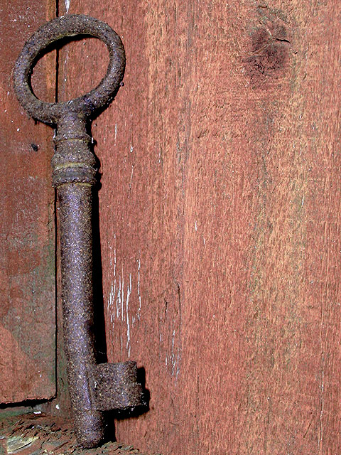
| nice detail...but the key is a bit too far to left in my eyes. |
|
|
|
08/08/2002 11:14:00 PM |
| I like the photo but its a bit static. Need more in the picture to make it interesting |
|
|
|
08/08/2002 07:37:00 PM |
| Wow - look at the texture on that key. I like the framing too. Light is perhaps a little harsh. |
|
|
|
08/07/2002 07:36:00 AM |
|
|
|
08/07/2002 12:05:00 AM |
| These old keys like this are really neat :) This photo does a good job of showing the age of this key and the background works well too. My only suggestion for possible improvement would be to back up just a tad to allow some breathing room for the key along the edges of the frame... - jmsetzler |
|
|
|
08/06/2002 09:17:00 PM |
nice key, i wish the background had provided more of a contrast for it, however. ~mcmurma
Aesthetics...6
Meets Challenge...6
overall...6 |
|
|
|
08/06/2002 07:50:00 PM |
|
|
|
08/06/2002 03:39:00 PM |
| i like the way you have captured the detail of the wood and key. Maybe cropped/framed a little too tightly on the top and bottom. karmat |
|
|
|
08/06/2002 01:38:00 PM |
| Why is the key so far to the left? |
|
|
|
08/06/2002 10:40:00 AM |
| Very interesting, I like the composition and color. |
|
|
|
08/06/2002 07:50:00 AM |
| Good texture on the key here. |
|
|
|
08/05/2002 10:22:00 PM |
| Rule of THIRDS not FIFTHS. Move the key over to the right a bit. |
|
|
|
08/05/2002 10:19:00 PM |
| THe detail is really very good and I like the offset. 9 |
|
|
|
08/05/2002 08:31:00 PM |
|
|
|
08/05/2002 05:04:00 PM |
| I love macro - I love the way this looks like a giant key leaning on a door... An unusual method of locking a door. I have to score it 10 on the grounds that it meets the challenge and not because I'm a macro fan, it's also a blooming good shot - so I have... It deserves to do well... |
|
|
|
08/05/2002 03:02:00 PM |
| My kind of picture. :-) 8 |
|
|
|
08/05/2002 02:10:00 PM |
| More color contrast would have helped the key stand out. |
|
|
|
08/05/2002 01:50:00 PM |
| I think this may have worked better with some different lighting and maybe less of a vertical position for the key to add interest. Maybe try hanging the key from a nail to put some space between it and the wood? Lisa |
|
|
|
08/05/2002 01:19:00 PM |
| I find the wood too similiar in color and texture to provide a good background. I'd like a higher contrast. |
|
Home -
Challenges -
Community -
League -
Photos -
Cameras -
Lenses -
Learn -
Help -
Terms of Use -
Privacy -
Top ^
DPChallenge, and website content and design, Copyright © 2001-2025 Challenging Technologies, LLC.
All digital photo copyrights belong to the photographers and may not be used without permission.
Current Server Time: 03/12/2025 10:29:22 PM EDT.