| Author | Thread |
Comments Made During the Challenge  |
|
|
10/14/2003 07:44:30 AM |
|
 Photographer found comment helpful. Photographer found comment helpful. |
|
|
10/13/2003 11:24:44 PM |
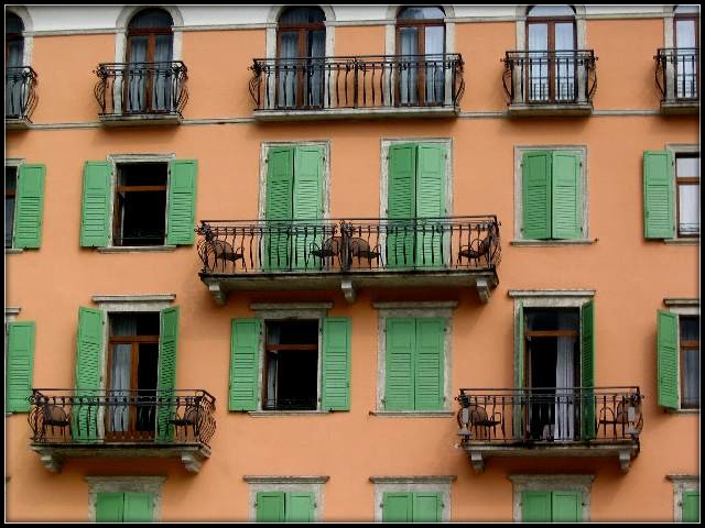
| Lovely colors. Good focus. Very quaint. Well done. |
|
| Photographer found comment helpful. |
|
|
10/13/2003 06:41:20 PM |
| Great house I like how its just a little bit not vertical (dont know the word sorry) Remindes me of Italy or something Good job - 9 |
|
| Photographer found comment helpful. |
|
|
10/13/2003 06:09:29 PM |
|
| Photographer found comment helpful. |
|
|
10/13/2003 01:53:41 AM |
| image could use some sharpness and contrast, but love the idea (repetitve shapes geometric shapes vs delicate balconies, the colors,etc) . :o) |
|
| Photographer found comment helpful. |
|
|
10/12/2003 10:59:37 AM |
| Very interesting. I wish you wouldn't have cropped the top arches off. I love the colors, and the architecture in the balconies, shutters and moldings. Lovely overall: 8 |
|
| Photographer found comment helpful. |
|
|
10/11/2003 07:34:11 PM |
| Very nice...any chance this is in San Remo? |
|
| Photographer found comment helpful. |
|
|
10/11/2003 07:22:06 PM |
| I like this subject. I just think that shooting it square on would have made the composition more balanced and 'designed'. The diagonal at the top is unaesthetic. |
|
| Photographer found comment helpful. |
|
|
10/10/2003 04:03:03 AM |
| the angle this photo was taken could be improved, thought I'm not really sure which will work best. did you try other angles? 6 |
|
| Photographer found comment helpful. |
|
|
10/09/2003 10:37:15 PM |
| I love the colors in the image. |
|
| Photographer found comment helpful. |
|
|
10/09/2003 06:10:06 PM |
Nice - I almost want to see someone sitting on the right hand balcony/left seat.
Well seen, if the image could been composed toatlly square on I would have given 9 but I am still sufficiently impressed to offer 7 |
|
| Photographer found comment helpful. |
|
|
10/09/2003 01:54:14 PM |
| I like this image, especially the colors. It is unfortunate that the zoom lenses we use allow the image to be razor sharp level at the bottom like this one, but at the the top it is unbalanced. |
|
| Photographer found comment helpful. |
|
|
10/09/2003 12:13:51 PM |
| Is this in NY City or Boston? |
|
|
|
10/08/2003 11:18:35 PM |
| Dazzling color combination and knocklut ironwork. A good choice of excerpt from the building to bring out the details. |
|
| Photographer found comment helpful. |
|
|
10/08/2003 04:12:59 PM |
bonus for finding symmetry,
minus for not closeing all the doors and windows... just jokeing!
great find! |
|
| Photographer found comment helpful. |
|
|
10/08/2003 03:06:18 PM |
| Nice composition and great color. A straighter view would be even better. |
|
| Photographer found comment helpful. |
|
|
10/08/2003 01:06:41 PM |
This is a great building, and shot the colours and the balconies are great, reminds me of my trip to italy.
My only objection is I think I would like to see the white at top cropped out. |
|
| Photographer found comment helpful. |
|
|
10/08/2003 09:24:07 AM |
|
|
|
10/08/2003 02:47:49 AM |
| I like the symmetry and the color very much. |
|
| Photographer found comment helpful. |
|
|
10/08/2003 02:04:56 AM |
| cool photo. I love the vivid, contrasting colors....interesting subject matter! |
|
| Photographer found comment helpful. |
|
|
10/08/2003 12:22:33 AM |
| I love the symetry in this shot. However, the photo is slightly rotated and the framing doesn't match the symetry. It would have been better if you took the picture from a location cenetered about the middle of the long balcony. |
|
| Photographer found comment helpful. |
Home -
Challenges -
Community -
League -
Photos -
Cameras -
Lenses -
Learn -
Help -
Terms of Use -
Privacy -
Top ^
DPChallenge, and website content and design, Copyright © 2001-2025 Challenging Technologies, LLC.
All digital photo copyrights belong to the photographers and may not be used without permission.
Current Server Time: 03/12/2025 07:08:18 PM EDT.