| Author | Thread |
|
|
10/26/2006 06:09:54 PM |
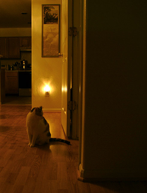
If you re-crop the photo so that the cat and the light were the main portion of the photo - i think the photo would have come off better. The blackened right half of the photo make the image seem only half there.
The glow in the photo from the light is quite nice, but the composition of the image and distractions such as the lights off the pot on the stove detract from the good stuff.
|
|
|
|
10/25/2006 07:01:34 PM |
| I would agree with the "heavy" comment on the right as well as the kitchen pulling my eye (and not being an important element in the composition). WHile the back door frame appears to be straight, the formost wall isn't (adding a bit of distraction). The cat's pose didn't engagement (no face, tough to see) and light didn't help send a message other than "night" Those factors kept it in the middle of the pack for me. |
|
|
|
10/25/2006 06:55:29 PM |
The subject for me was the cat the light didn't highlight the cat in anyway in fact the cat is underexposed. also the dark shadow on the right is distracting and could have been cropped out. The kitchen in the background also doesn't ad to the shot.
I would suggest getting lower and closer eliminate the distractions and more light on the subject. |
|
|
|
10/25/2006 06:54:10 PM |
Here is my stab at the pic... First, it seems rather heavy on the RH side of the frame with the heavy shadow area. The light behind the cat provides such a bright spot that it overshadows the image of the cat and its silhoette(sp). I think the picture would have benefited by a little less shadow on the RH and placement of the light behind the cat or even out of the frame.
OK, i reallize most cats don't pose on command so it would be hard to make this happen but i think the picture(and the score) might have been improved.
Picture also seems a bit soft, maybe the .8s shutter speed was responsible for this. Overal, not an unpleasing photo, just one that needs some compositional and technical tweaks to really make it shine. And never underestimate some people's hatred of cats! :) |
|
Comments Made During the Challenge  |
|
|
10/19/2006 09:38:34 PM |
|
|
|
10/18/2006 03:22:59 AM |
| And I bet your vet has had words with you about his weight:) Lovely composition |
|
Home -
Challenges -
Community -
League -
Photos -
Cameras -
Lenses -
Learn -
Help -
Terms of Use -
Privacy -
Top ^
DPChallenge, and website content and design, Copyright © 2001-2025 Challenging Technologies, LLC.
All digital photo copyrights belong to the photographers and may not be used without permission.
Current Server Time: 03/12/2025 05:43:47 PM EDT.